I had been following Karol (CEO of RepoPC) since his days as a pro gamer. After retiring from competitive play, he shifted his focus to building and optimizing PCs. Well-known and respected in the gaming community, he collaborated with popular creators and players like Xayoo, Snax, Tuszol, Dzinold, and many more.
Despite doing solid work and having a strong client base, I saw huge untapped potential in his business; everything was hidden behind weak presentation: no branding, no website, no marketing, no real reach to new customers.
I reached out to Karol with a proposal to help unleash that potential I clearly saw and that’s how everything started...


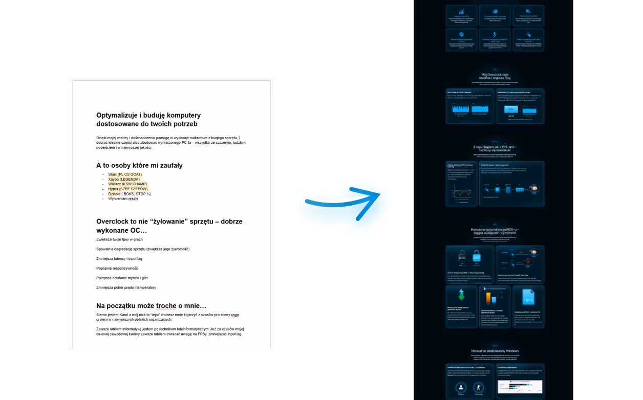
At first, Karol’s business looked like a mess: the logo, pricing, overall layout, nothing made sense or felt cohesive. It didn’t look professional, and at first glance it failed to build the trust that Karol could actually deliver thanks to their proven collaborations with top-tier creators and gamers. Online, Karol had already earned trust from people who knew him, but new clients couldn’t see that at a glance.
Karol had worked with a massive number of well-known creators from community names like: Xayoo, Snax, Tuszol, Dzinold, and many others (pro players, streamers, influencers). He had strong testimonials and a portfolio packed with familiar faces. But all of that credibility was hidden. My job was to fully bring it to the surface and make it work for the brand.
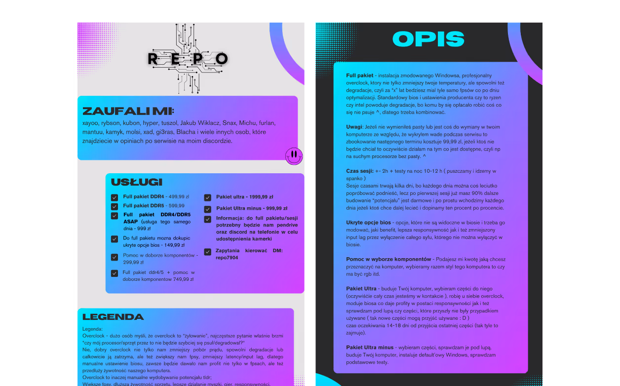
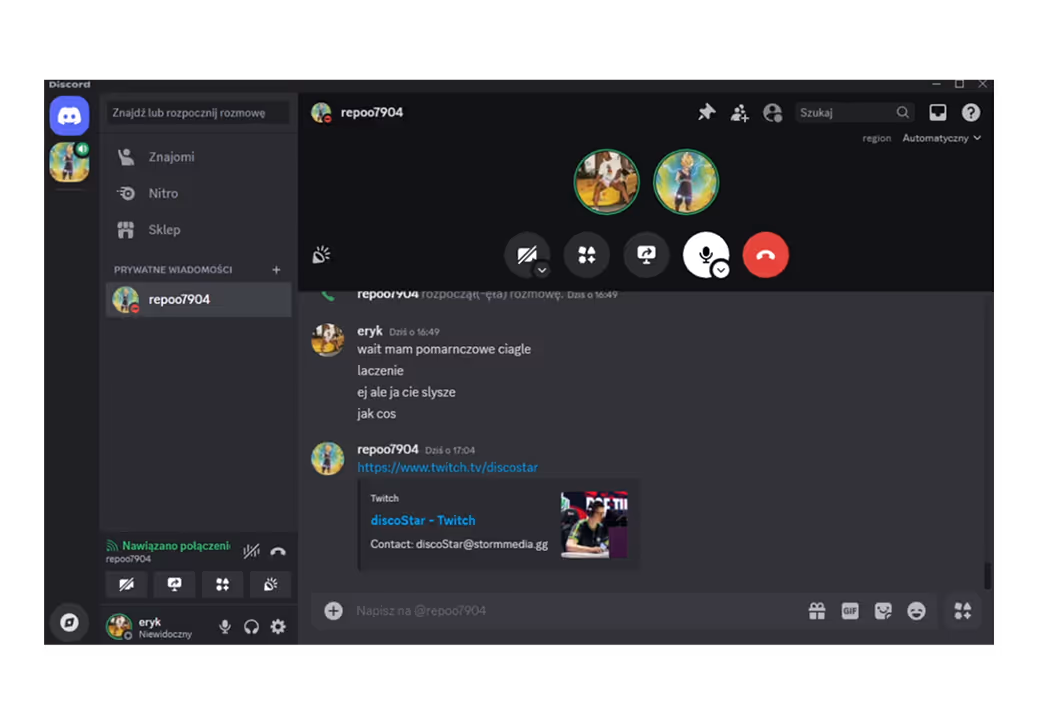
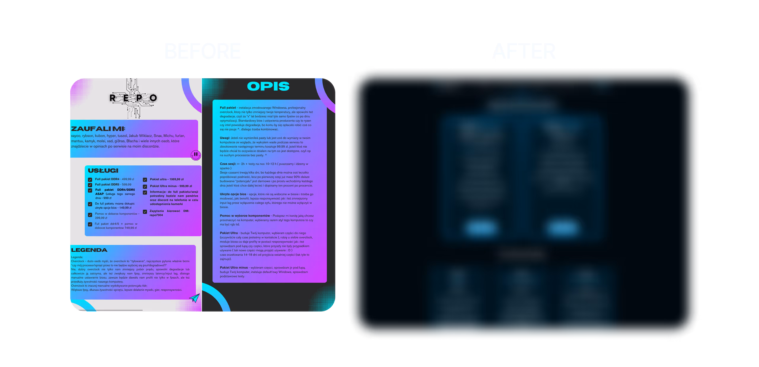
Karol’s service offer looked like a meme “graphic design is my passion” graphics compressed into a PDF pinned on a Discord channel. Everything felt chaotic, no one really understood what was going on. Every new interested person had tons of questions because it was hard to make sense of the offer. Even Karol himself admitted during our conversation that it looked terrible and that it desperately needed to be changed. From a UX perspective, the cognitive load on the user was overwhelming — the sheer chaos made it hard to process or navigate the offer.
Karol’s branding or rather, the complete lack of it was holding him back. He had no visual identity. What he called a “logo” and the service graphics were made by a random designer from a past collaboration, with no cohesive style or direction. All his key touchpoints: Discord, social media, service materials lacked any kind of visual system. There was nothing that reflected the actual quality of his work or made his business look professional and trustworthy. To a first-time customer, it simply didn’t feel like a real brand.
HMW (How might we?)
The entire design, new branding, landing page, and marketing materials were all tools crafted to help achieve clearly defined and measurable goals.

Previously, client acquisition happened mostly through word of mouth. The main objective was to expand the reach and bring in new clients beyond referrals.

Growing the number of members on the Discord server was directly tied to conversion. Since Karol’s business originally operated mainly through Discord, he didn’t want to give that up. Maintaining easy and direct contact with clients and community members was a huge advantage, so increasing server growth was also an important target.
Karol’s branding or rather, the complete lack of it was holding him back. He had no visual identity. What he called a “logo” and the service graphics were made by a random designer from a past collaboration, with no cohesive style or direction. All his key touchpoints: Discord, social media, service materials lacked any kind of visual system. There was nothing that reflected the actual quality of his work or made his business look professional and trustworthy. To a first-time customer, it simply didn’t feel like a real brand.
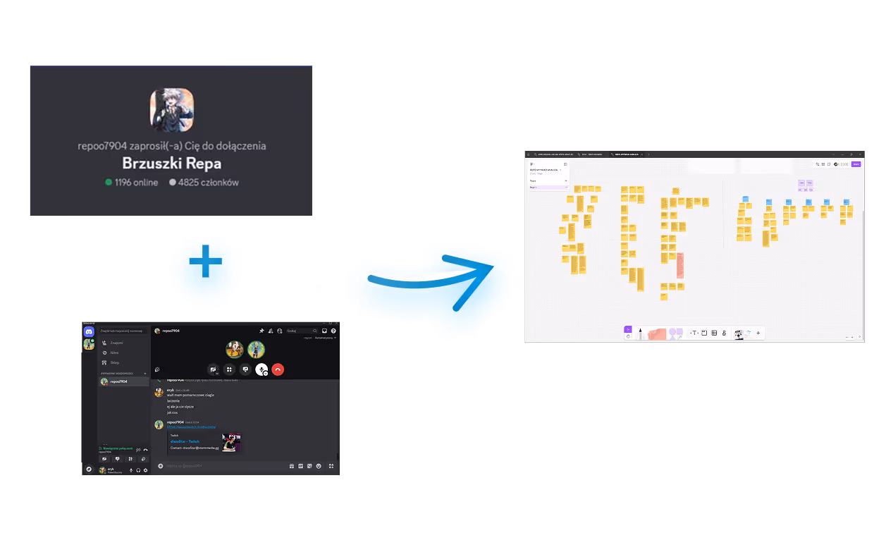
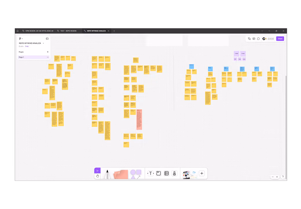
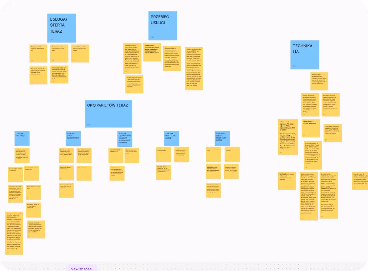
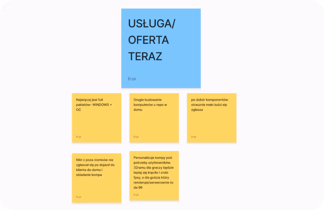
From my in-depth interview (IDI) with Karol, I created a transcript which I then analyzed and pulled the most important insights onto Figma sticky notes. I grouped similar insights into clusters such as services, clients, competition, website; which made it easier to plan new iterations. From those post-its, I also defined the JTBD persona and insights that later helped during competitor analysis, so I had a solid foundation.
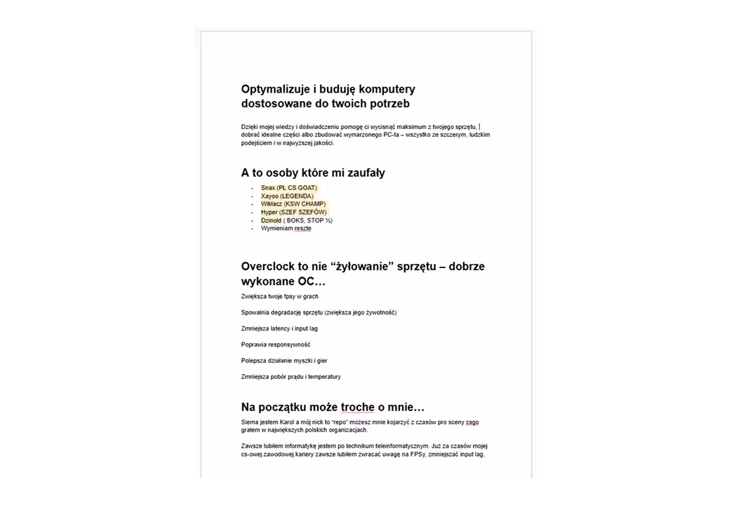
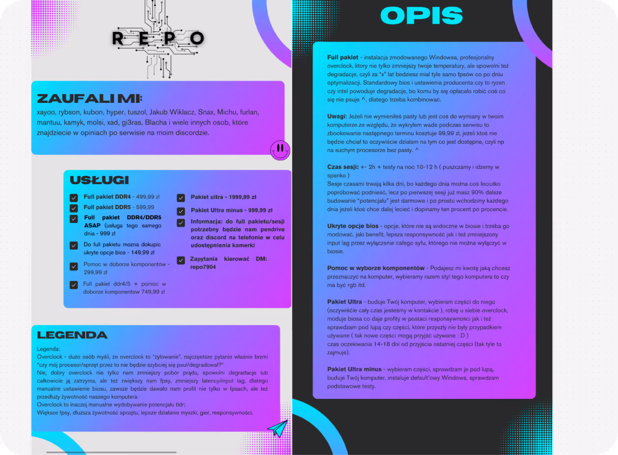
This is how Karol’s business offer looked before. Two chaotic, unreadable and confusing graphics shared on his Discord channel. I tried diving into them before our interview to see it from a client’s perspective, and I have to admit. it gave me a headache and was a bit off-putting.
💬 The offer actually hid a lot of useful information such as:
- Social proof – the list of trusted creators and figures in the space
- A surface level overview of services and offerings
In the entire IDI, my questions were structured to extract key insights. I started by digging into Karol’s current service setup and offer, trying to get the most specific and clearly defined information.
💬 I clarified several service-related clusters:
- how the offer looks today
- what the delivery process looks like
- what are the service tiers/packages, how they work technically, all the "nitty-gritty" Karol explained to me in detail.
- Information about the best-selling packages (top 3) and those that sell poorly or are unused
- The service is executed “based on user needs”. Karol tailors it personally to each case
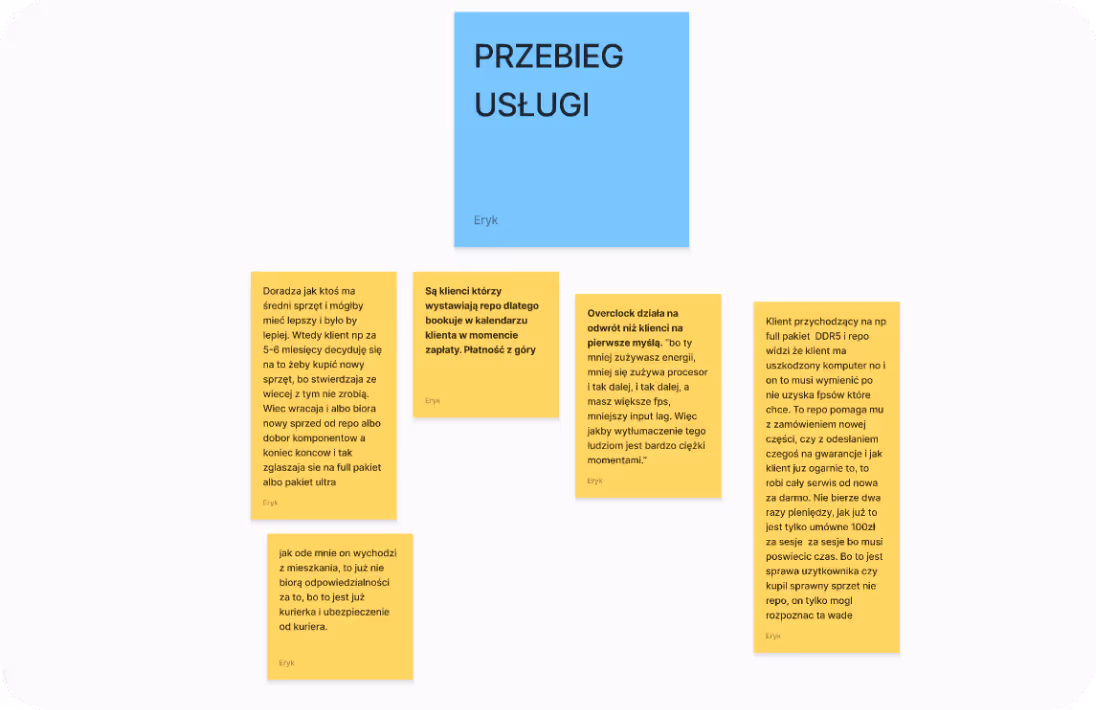
- Everything is done via Discord server
- "Overclocking works opposite to what clients think" – clients often don’t understand how it actually works
- Some situations arise where a client flake on Karol, so he takes payment upfront before starting the service
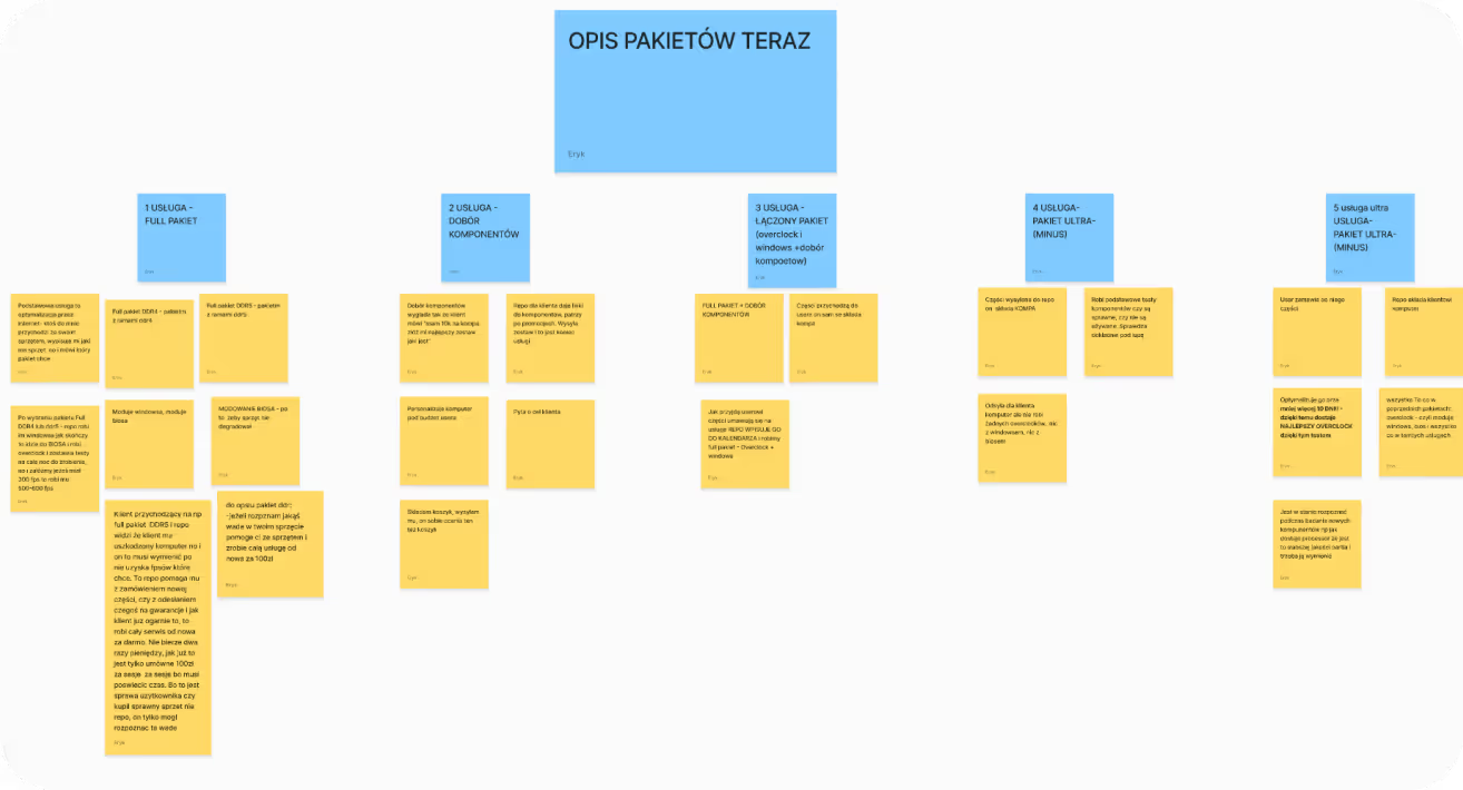
- Detailed info on what each package/service includes
- Learned which version of the service is most commonly chosen by clients and why
- Clients end up using the full service, even if they initially came with a smaller need (lower package)
- Discovered the key needs of clients
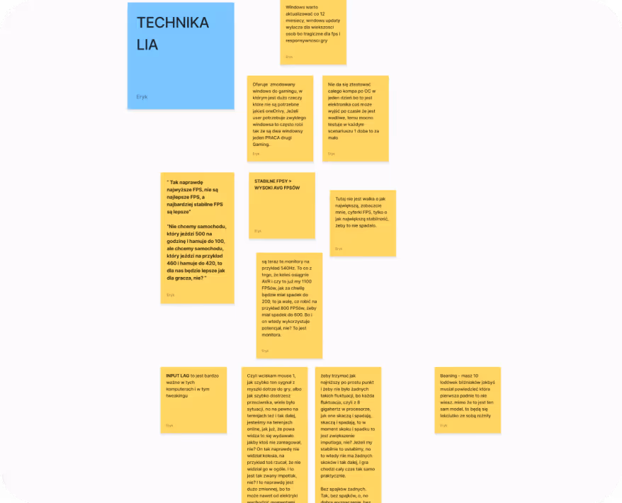
- For users stability and smooth performance matter more than raw technical specs
- “Stable FPS > High AVG FPS” turned out to be the most important insight, something clients were often unaware of
Here I focused on understanding Karol’s clients, where they come from, how often they return, what holds them back, and how the customer acquisition mechanism works. I wasn’t just interested in who currently uses the service, but also what barriers potential clients face and how loyalty among existing clients looks.
💬 Based on this, I outlined four key areas:
1. Where does the traffic come from?
2. Who are the returning clients?
3. What are their doubts and concerns?
4. How does acquisition work for people outside the community?
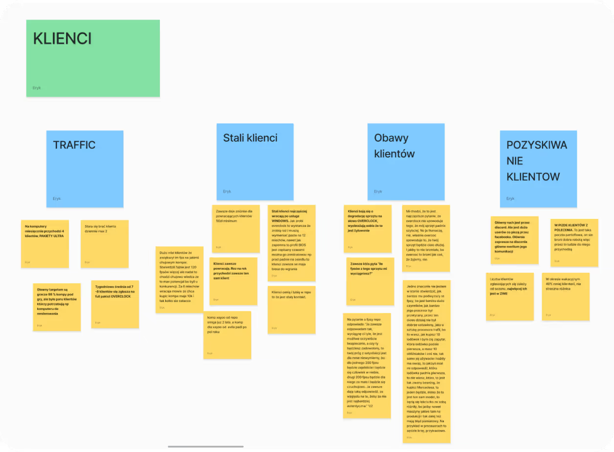
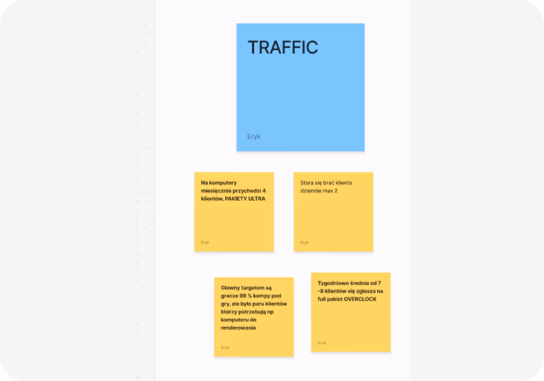
- Main target: the vast majority are gamers
- Client average: daily/weekly
- Most popular service: frequency per month
All this data helped me compare the business results before and after.
- The entire flow relies on referrals
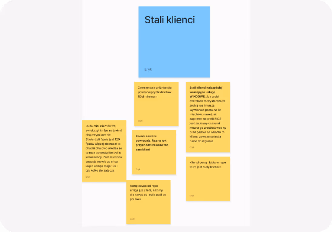
- I learned that a significant portion of clients returns regularly. some upgrade once a year or more often
- Returning clients value Karol not only for the service but also for communication and trust
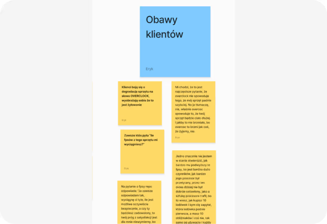
- “How many FPS will you get out of my PC?” – the classic golden question that always comes up
- Clients don’t understand exactly what overclocking is or what it does
- Undecided users often lack technical knowledge
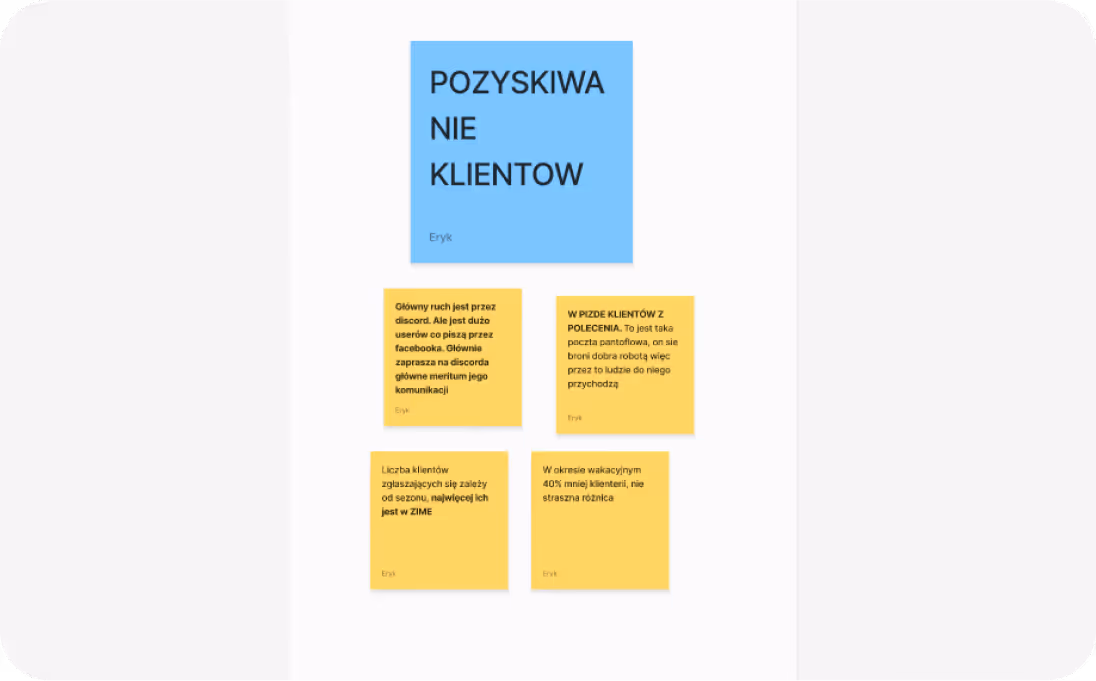
- The entire business runs on Discord, but a smaller portion of clients comes from Facebook
- Most of the traffic comes from referrals
- The biggest seasonal spike is in winter, when the visible number of clients increases
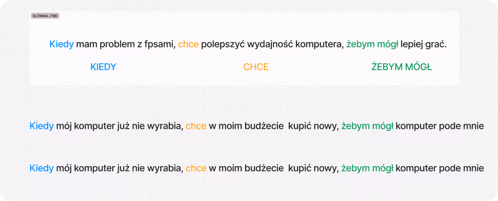
Having a strong grasp of Karol’s business and his clients, I created the main JTBD persona based on that knowledge. This will help guide future iterations and better understand the needs of potential clients.
In this part of the conversation with Karol, I focused on extracting insights about both the current project and possible future directions for business growth. Some ideas stemmed directly from Karol’s needs, others naturally emerged from observing his business model and client needs. However, to avoid losing focus and direction, I decided to define a North Star Metric to help prioritize the goals.
💬 From the interview, I also learned that Karol:
- Wants to operate mainly through Discord – it’s his natural workspace and the main channel for communication with clients
- I suggested to redefine the current offer – change the structure of his current packages, remove a few outdated things and introduce a new “streamer offer”
- Karol also said his favorite color is blue 😄
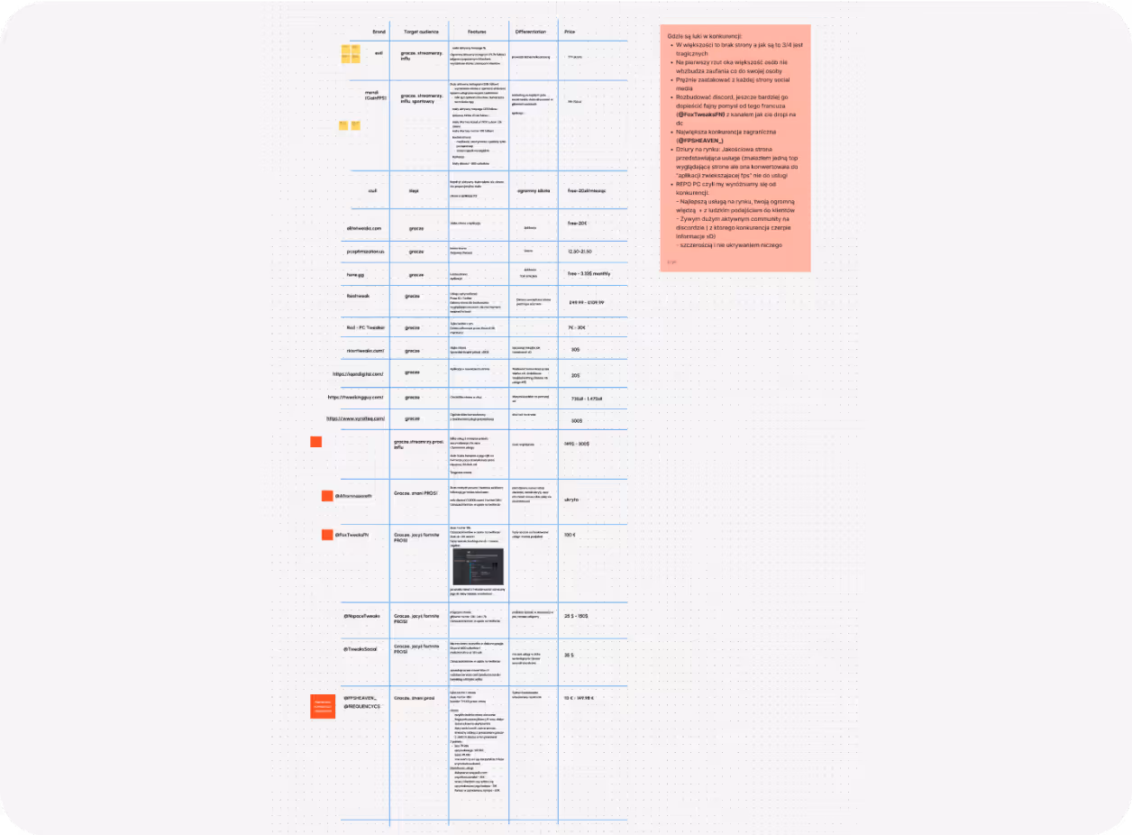
I conducted a broad and thorough analysis, exploring both the Polish and international markets. I examined the most well-known brands, some of which I got to know thanks to Karol during our interview. I thoroughly researched various brands: their target audience, features, differentiators, and pricing. This gave me a clear perspective on how the market is shaped.
💬 The main takeaway is that this is a niche market, most people operate at an amateur level, and there’s a lot of space to easily position yourself above the competition.
- We know that the website should direct users to Discord, since that’s Karol’s primary workspace and conversion point.
- We identified the need to reorganize and redefine the offer – so that it’s more understandable and better addresses client needs.
- We know the users habits and motivations, which will make future iterations and testing of new service directions much easier.
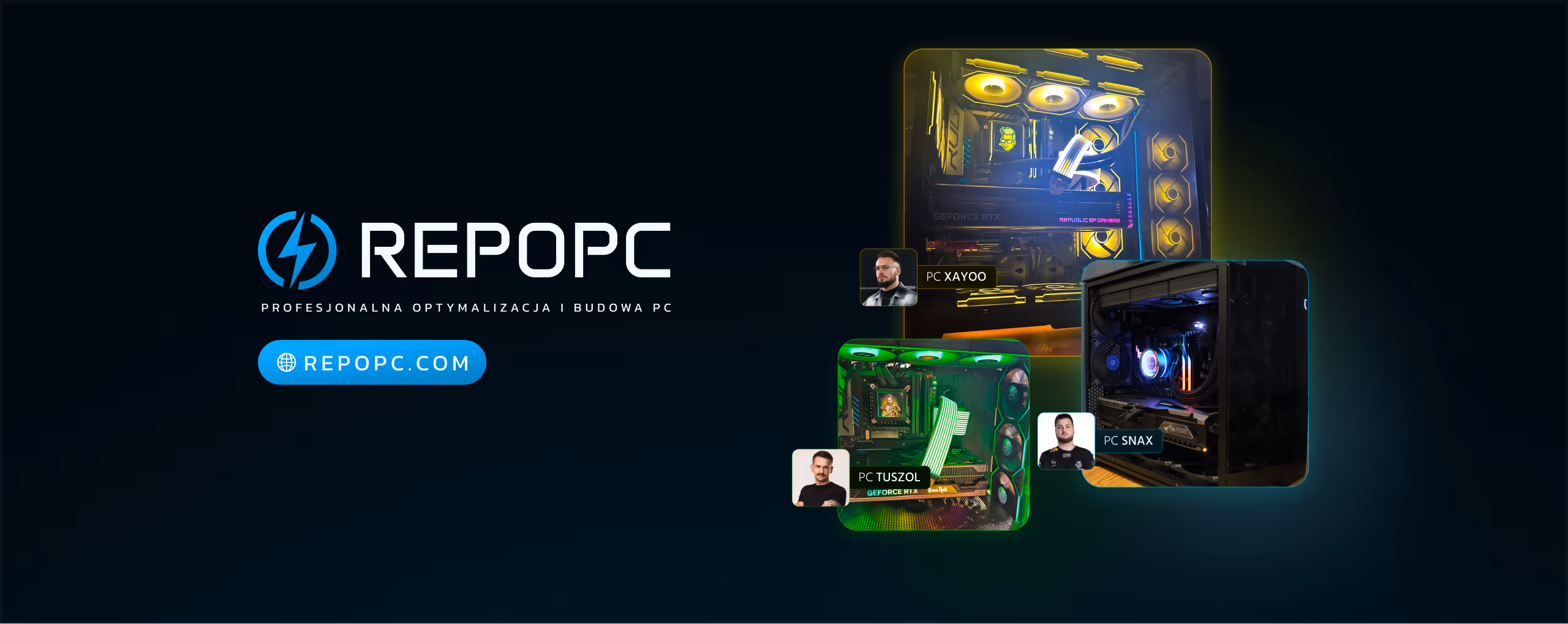
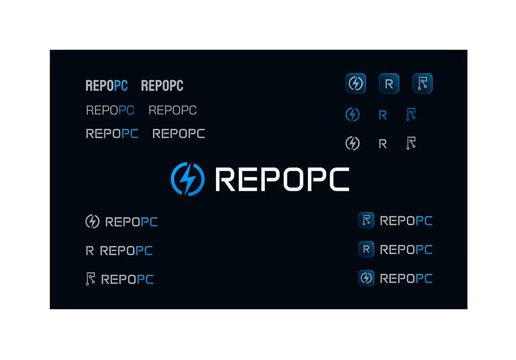
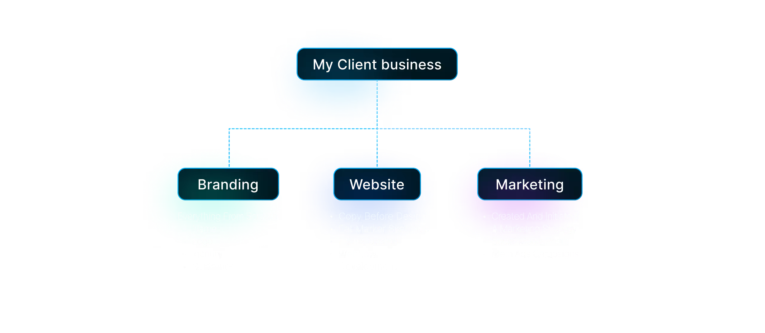
Everything – from the business name to marketing – was created from scratch. The entire design process was based on solid research I conducted at the start.
Based on that, I created a complete brand identity, including the business name, logo, visual style, and overall brand direction.
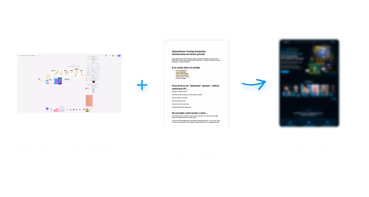
The website was built around a communication strategy that emerged from this research - copy before the design.
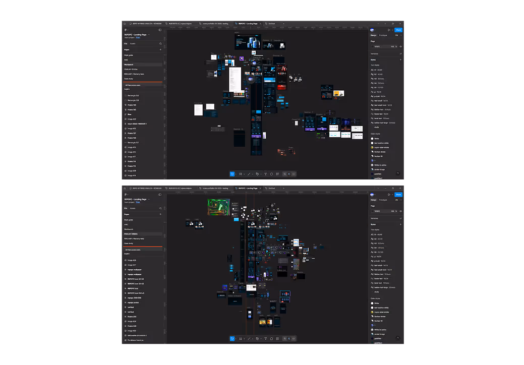
The design process included creating a moodboard with inspiration, building a style guide (a mini design system), defining layout proportions (grid, columns, margins, widths, etc.), quick marker sketches / simplified wireframes, and finally, designing the full UI in Figma and implementing it entirely in Webflow. I optimized the site for SEO and added animations to enhance the user experience.
On the marketing side, I developed a complete visual identity for social media, created a strategy based on an awareness funnel, and designed various ad formats (videos, static visuals, Twitch streamer banners), along with content for social media posts.
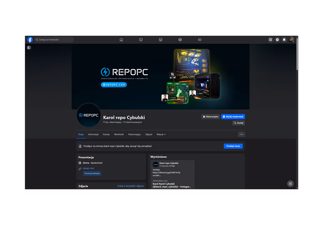
Why the name REPO PC? My client Karol was known in the gaming community under the nickname "REPO" – he had built a strong personal brand, a good name, and people recognized him. "PC" was added simply because Karol provides services related to computers – helping with optimization, builds, and much more. I suggested the name during our interview because Karol mentioned that he actually didn’t have a name for his business. I proposed 'REPO PC', and he instantly said that was the one :D
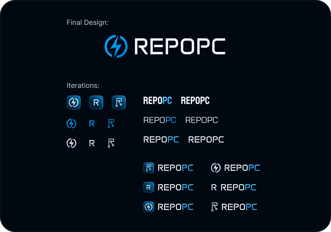
As I mentioned, Karol basically started from scratch. All he had was his Discord server, where he was in contact with his clients and that was it. It was a quick process, we went through several iterations and eventually chose the one that best suited Karol and visually reflected the direction we want to take with the website.
The website was built around a communication strategy that emerged from this research. Before moving into design, I wrote the entire messaging for the site in a structured, narrative letter to focus first on the content and clarity of communication
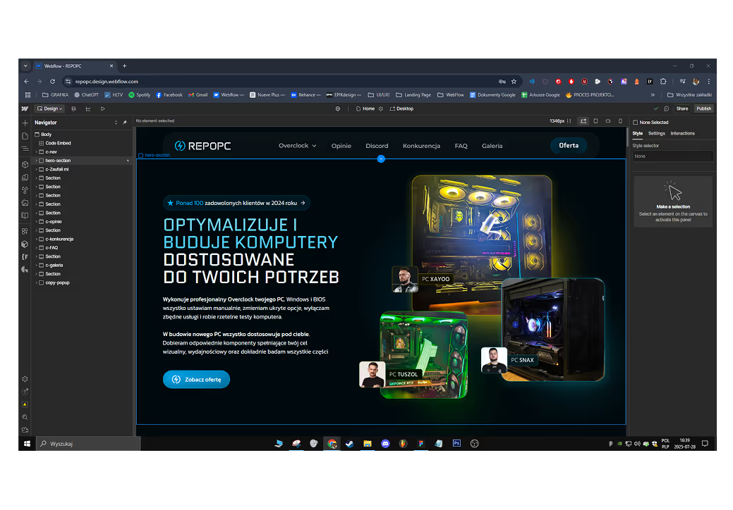
A simple yet consistent visual language based on bold typography, dark theme, and a touch of gaming aesthetics. Just enough to give the brand its own voice without overcomplicating the interface.
A simple yet consistent visual language based on bold typography, dark theme, and a touch of gaming aesthetics. Just enough to give the brand its own voice without overcomplicating the interface.

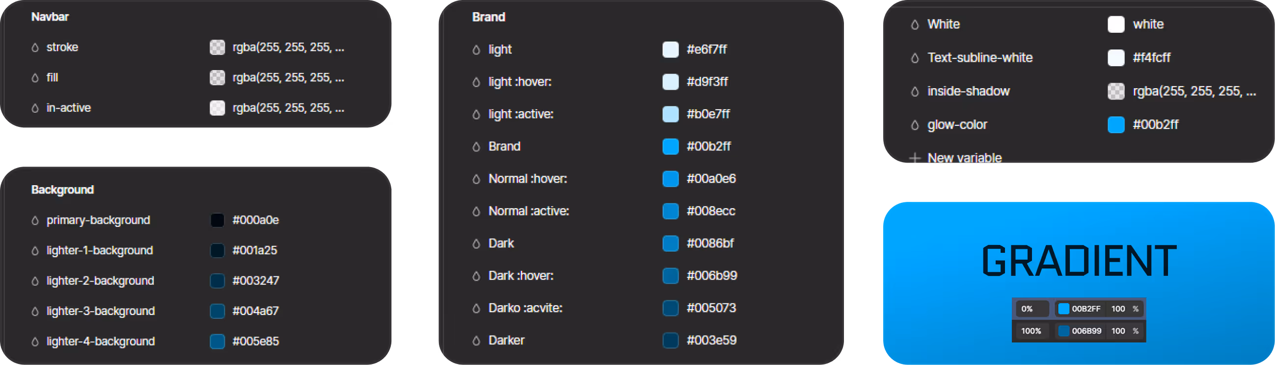
Following Karol’s note that he “just really likes blue 😄”, I went with a vibrant light blue as the core accent. The whole site runs on a dark mode foundation simply because gamers live in dark mode 😎 The result is a palette that feels modern, energetic, and tech-forward, while being easy on the eyes. visual language based on bold typography, dark theme, and a touch of gaming aesthetics.
Just enough to give the brand its own voice without overcomplicating the UI.
just a couple of components variants enough to maintain consistency across the site. Most sections were built using bento-style layouts, which allowed for clear structure and hierarchy. Thanks to predefined stroke weights and spacing, the whole interface feels sharp and cohesive.
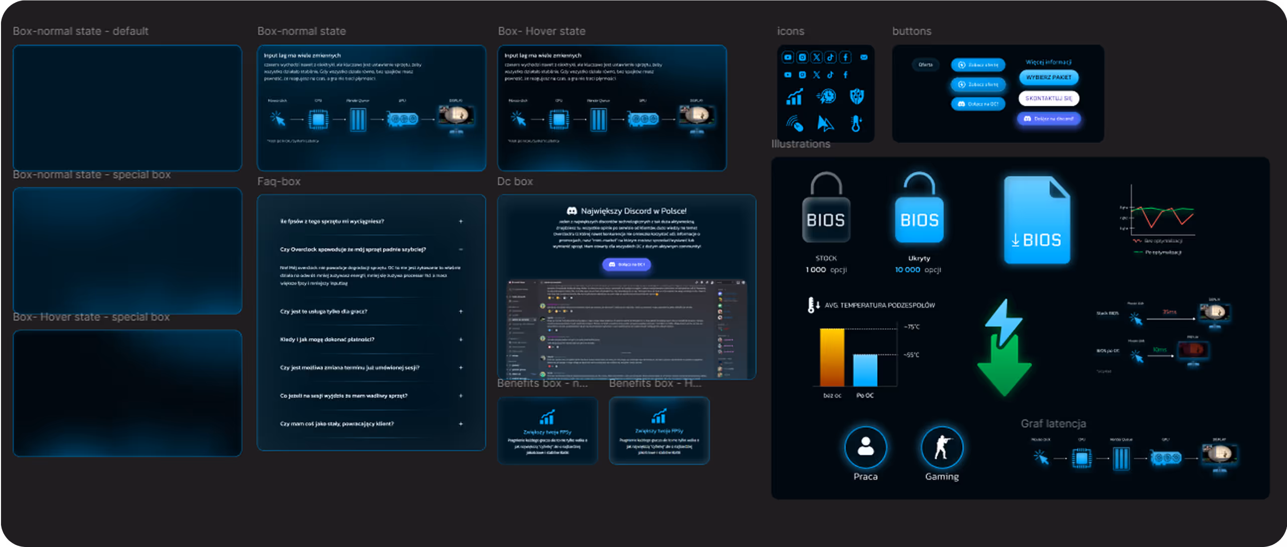
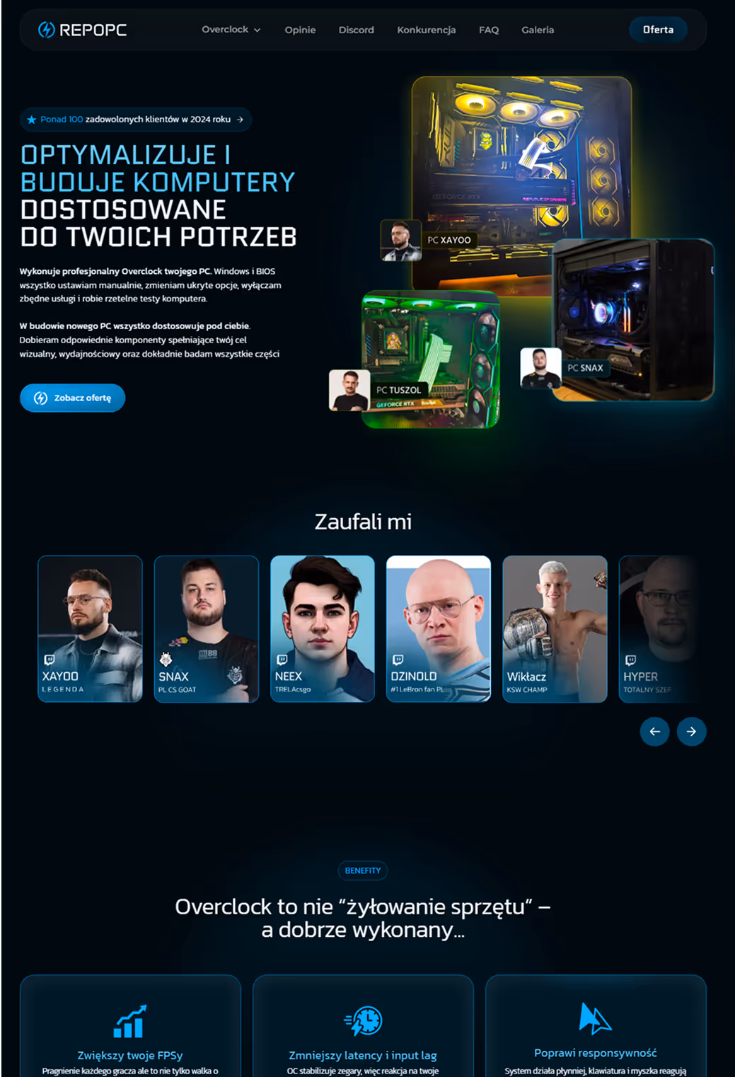
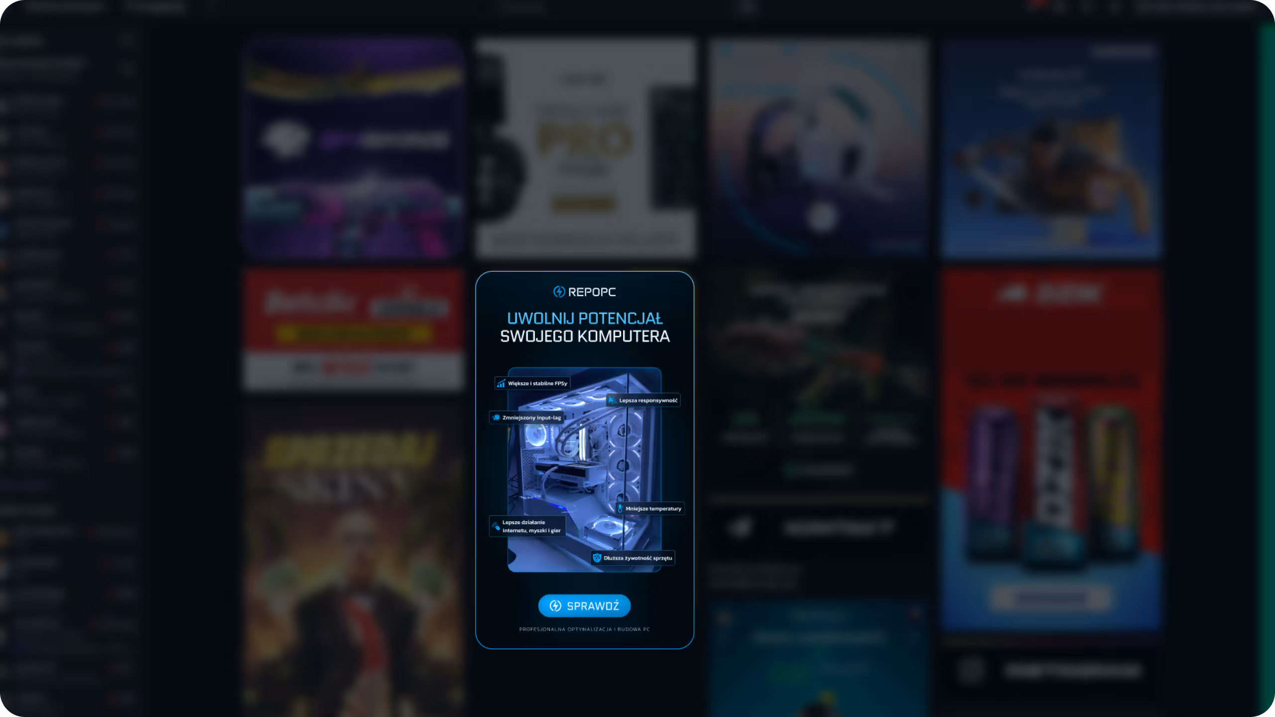
From the very first seconds on the site, we aim to build trust by showcasing to the people Karol's service social proof.
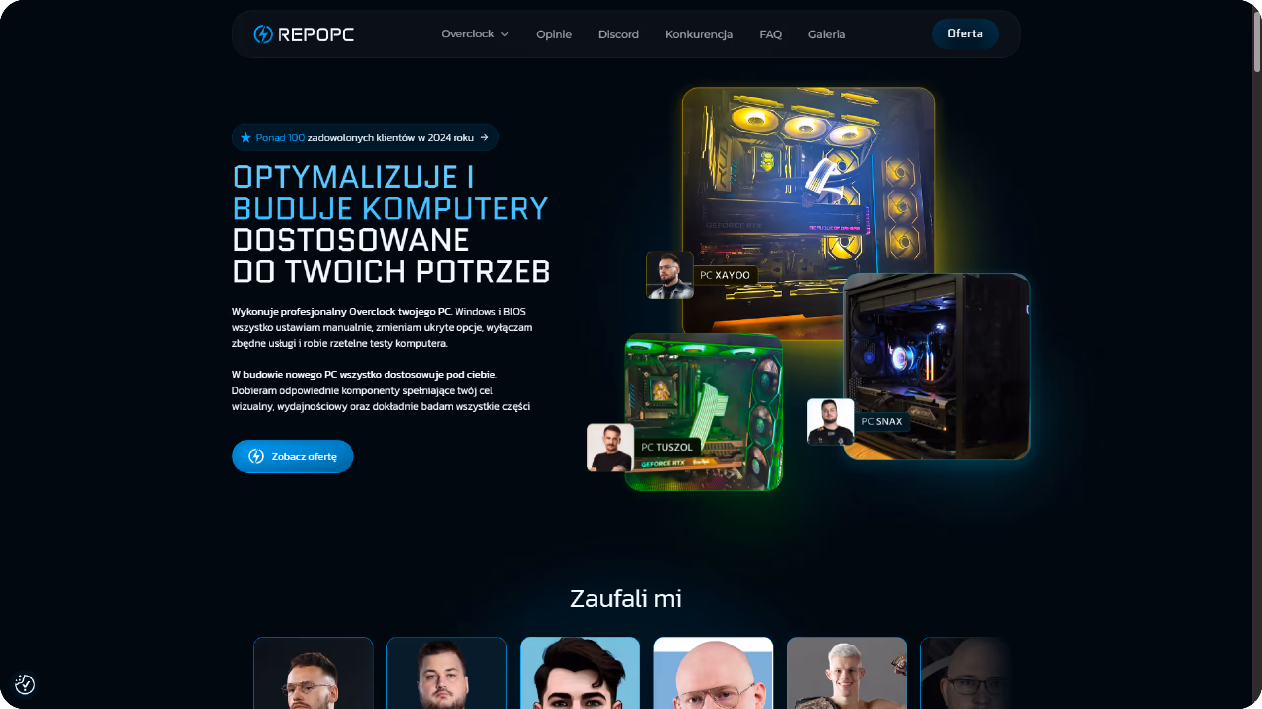


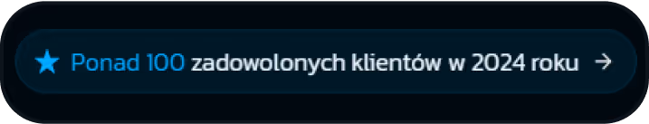
A label placed above the headline instantly builds trust by highlighting social proof — stating “100+ satisfied clients.” The star icon subtly suggests ratings or reviews, while the arrow icon at the end indicates interactivity. On hover, it hints at a clickable element that anchors the user directly to the testimonial section.
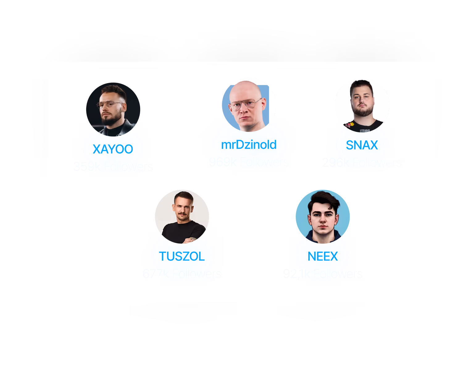
An interactive hero section that showcases real, personalized PC builds delivered to well-known clients. The featured images are carefully chosen for example, Xayoo and Tuszol have their logos displayed directly on the hardware, making it instantly clear these aren’t stock images but actual commissioned builds. Each tile includes the client's face, which acts as a visual scroll-stopper and enhances trust. On hover, the selected tile subtly lifts forward and animates its glow, adding a sense of depth and interactivity to the experience
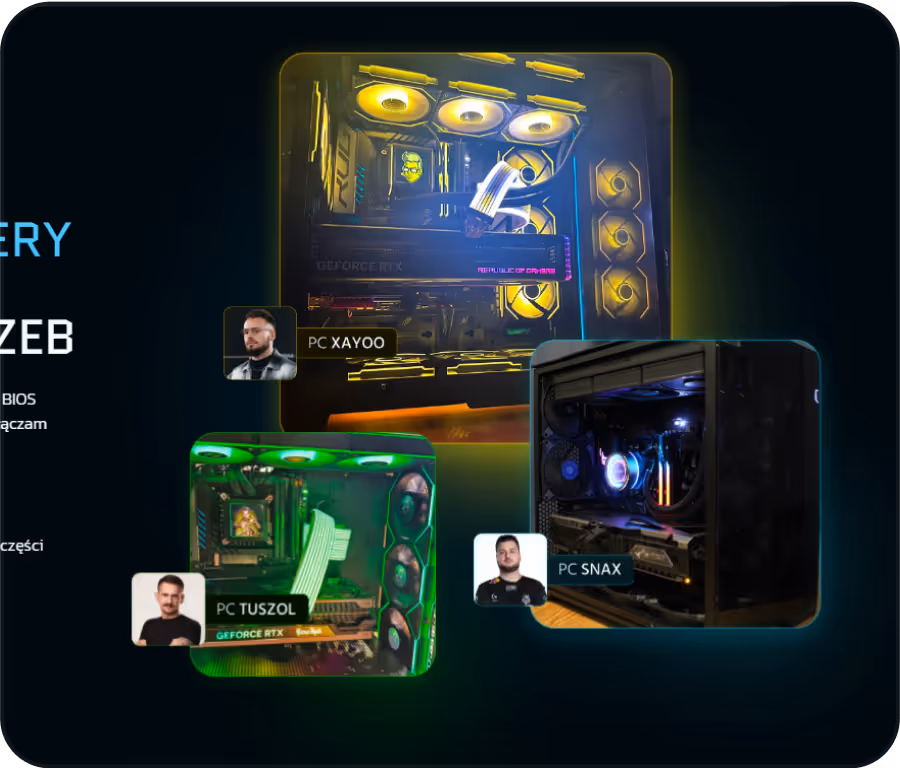
This section introduces a subtle sneak peek of the “Trusted by” carousel intentionally revealing just a portion of it to encourage users to scroll down. The carousel features faces of real people Karol has worked with, immediately establishing authentic social proof.
A partially visible human face acts as a psychological scroll-stopper, tapping into what's known as the human curiosity bias a well-known technique in thumbnail design. Instead of a plain horizontal list of nicknames, we used full client images to signal trust at first glance. Since Karol had no issue using the likeness of his clients, we were able to fully leverage the visual potential of this idea.
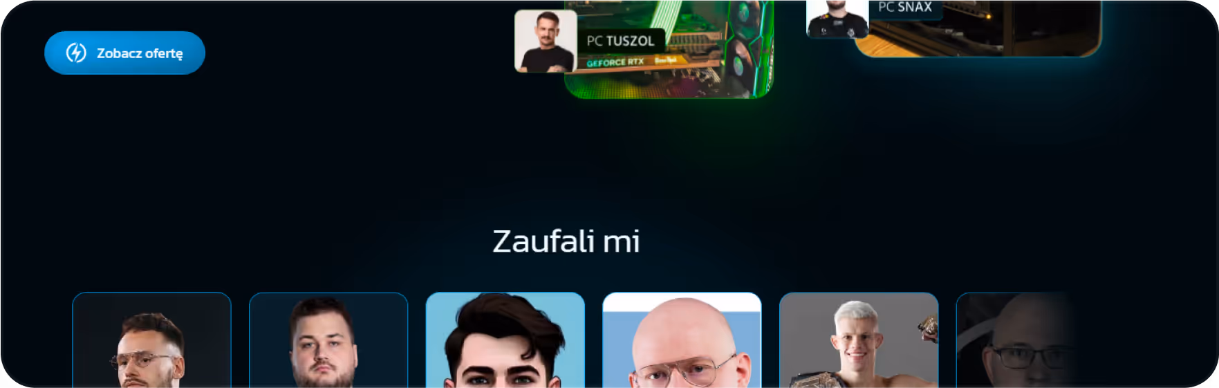
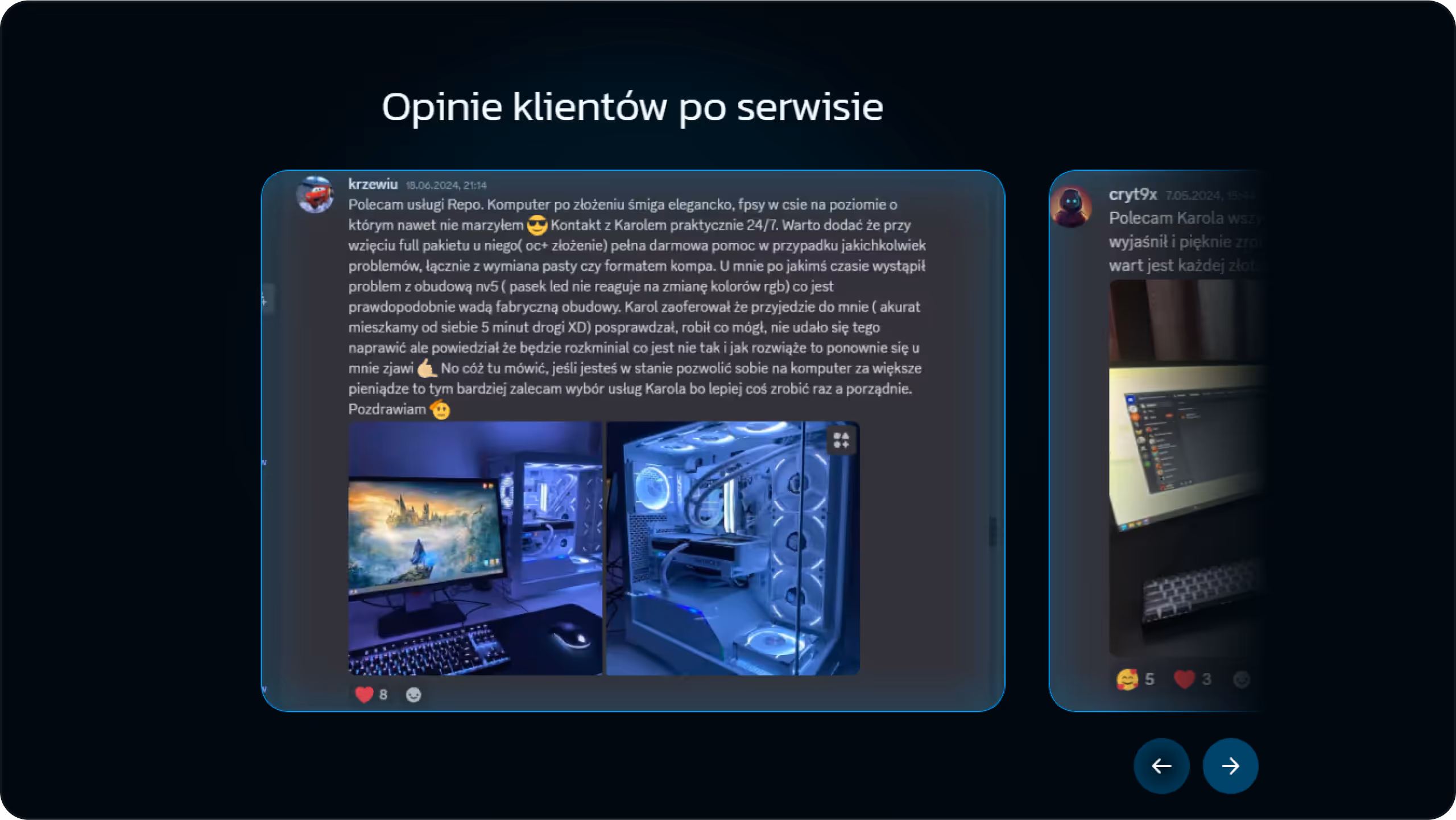
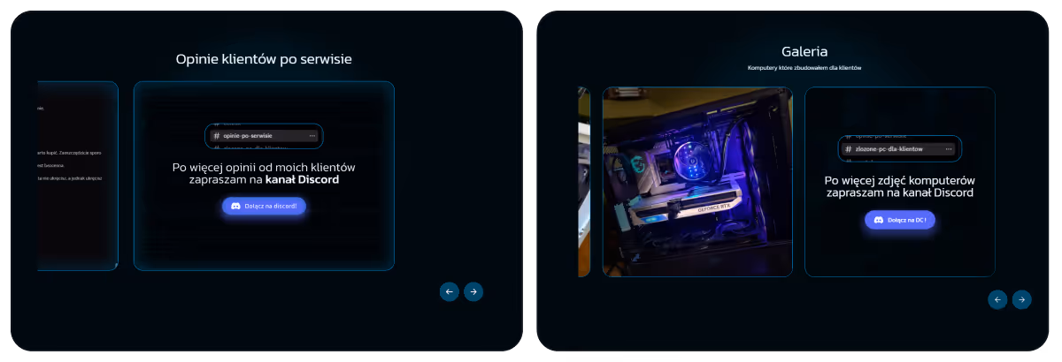
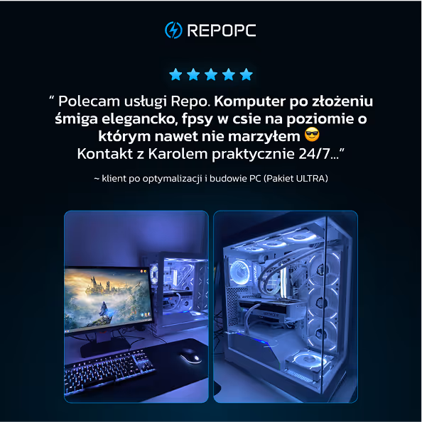
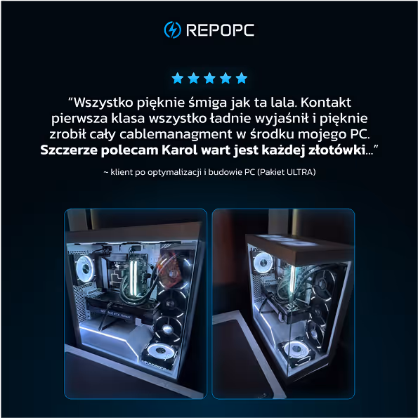
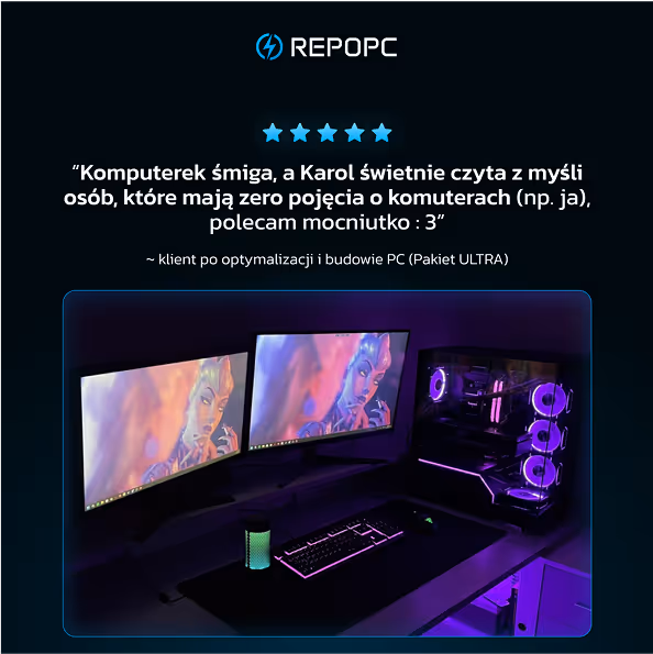
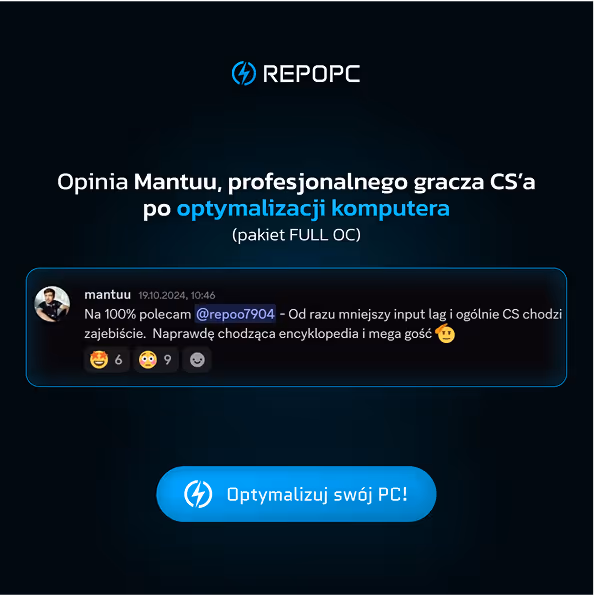
Karol runs a dedicated feedback channel on his Discord server where satisfied clients leave their opinions after the service. This is also the source of the “100+ happy clients” number used in the earlier label.
What makes these testimonials especially powerful is their authenticity some users voluntarily include photos of their setup after the service, taken and shared by themselves. These messages aren't polished quotes or generic review cards they’re real Discord messages with user avatars, reactions, and context. By showing actual screenshots, we emphasized genuine trust and avoided anything that might feel staged or artificial.
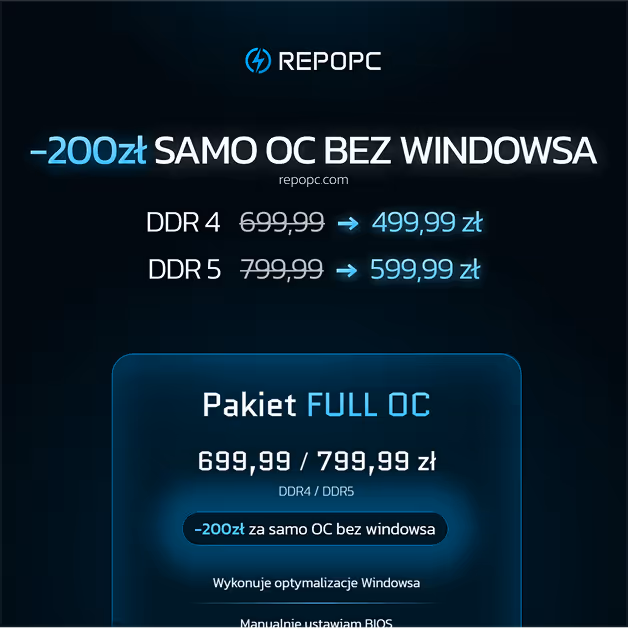
To avoid overwhelming users, I applied Hick’s Law, the fewer options, the faster the decision. That’s why the two best-selling packages were isolated and visually highlighted in a dedicated “most popular” section. This reduced friction in the decision-making process while steering users toward the most trusted choices.
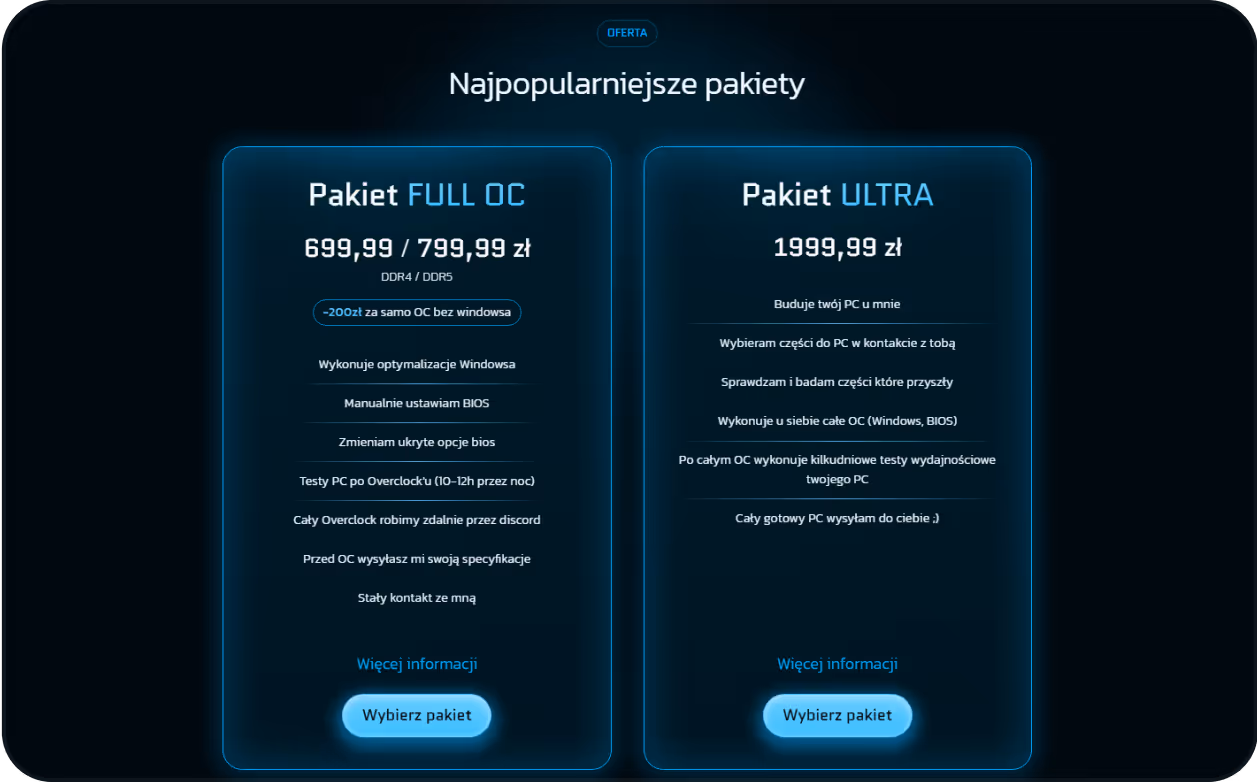
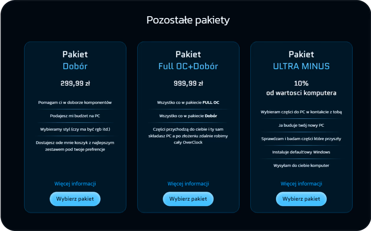
Despite the focus on clarity, three other packages were kept, they still serve specific user needs and had active demand. To keep Hick’s Law effective, I visually separated them from the “Top” section and placed them below on the page. This preserved simplicity without sacrificing sales.
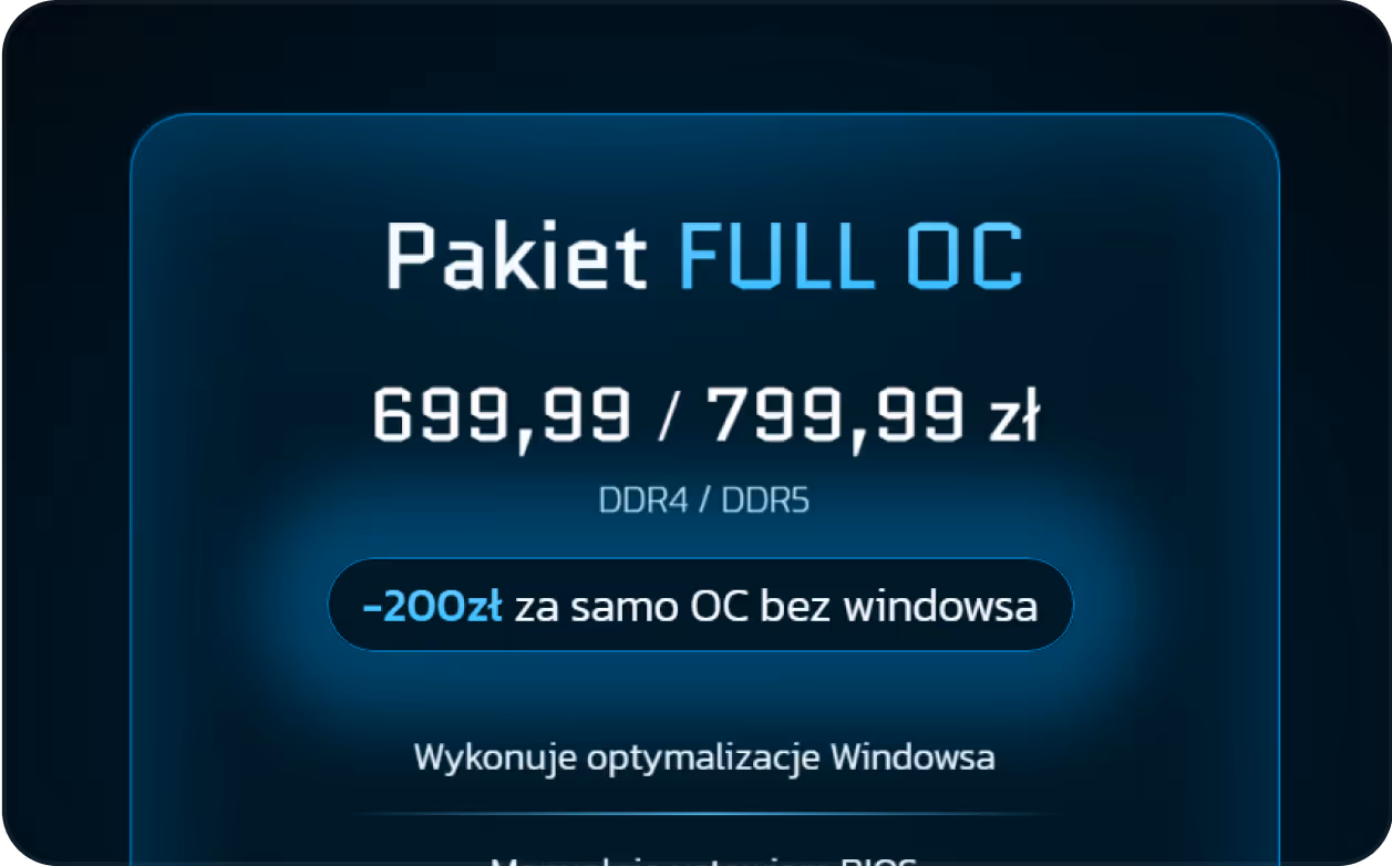
The original FULL OC package included both hardware overclocking and Windows optimization. After launch, multiple users started asking two recurring questions:
- “Can I buy just the overclocking?”
- “Would it be cheaper without the Windows part?”
Instead of introducing another standalone package and risking choice overload, I added a simple price variant directly inside the existing package block
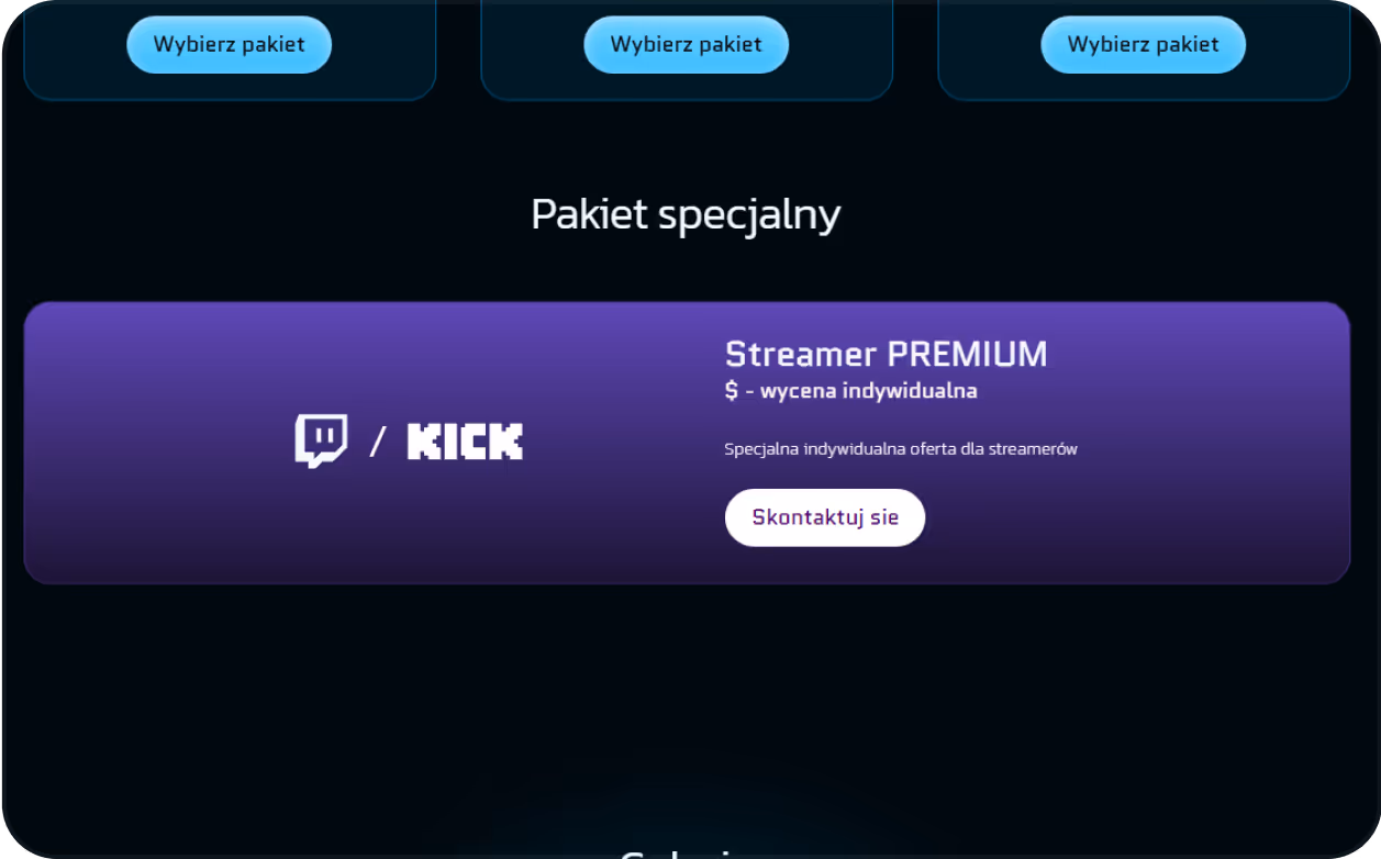
In response to Karol’s growing collaboration with influencers, I introduced a new “Streamer Premium” option. It acts both as an offer and a signal, encouraging potential content creators to reach out if they want a similar custom build. This small addition already attracted three new creator leads.
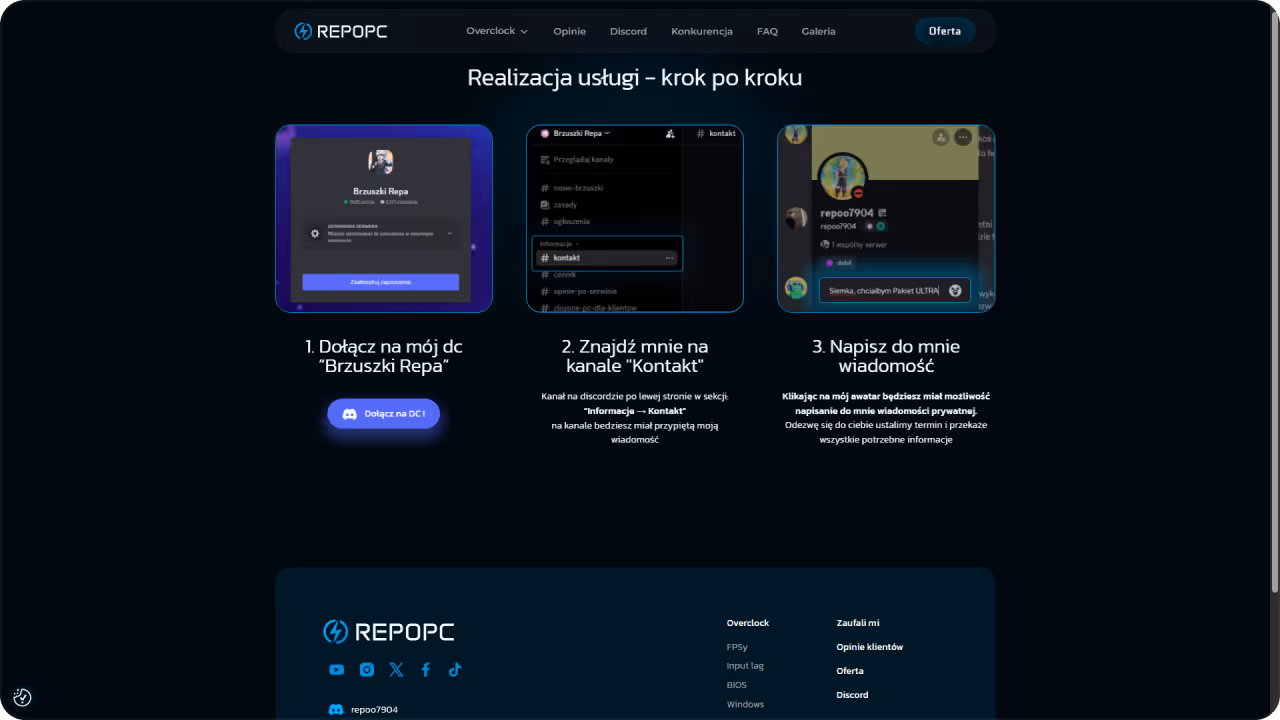
After choosing a package that fits their needs and clicking the “Select package” button, the user is taken to a dedicated subpage. There, three simple steps supported by visuals clearly show how to contact Karol and complete the service smoothly via Discord.
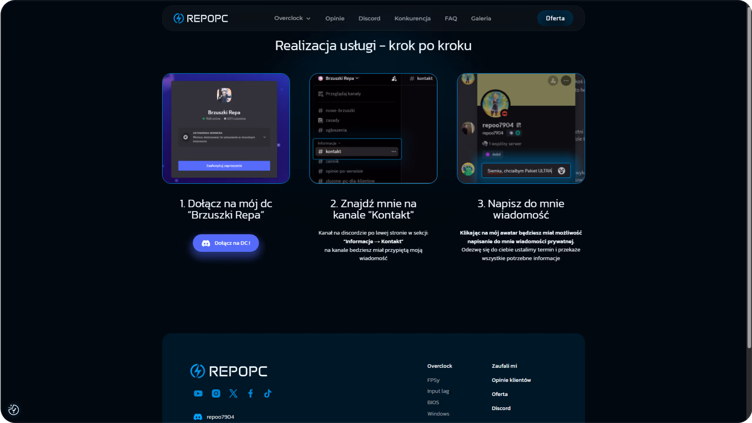
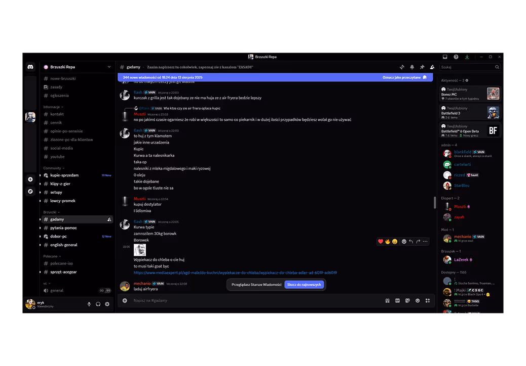
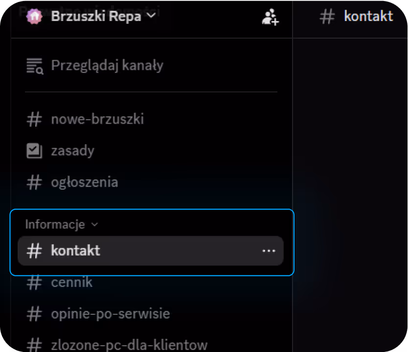
To support this custom flow, I reorganized Karol’s Discord server to feel intuitive even for users unfamiliar with the platform. I created a pinned “Kontakt” channel at the top with a single official message from Karol, so new visitors know exactly how to reach out. The goal was to remove friction and create a simple, trustworthy handoff experience.
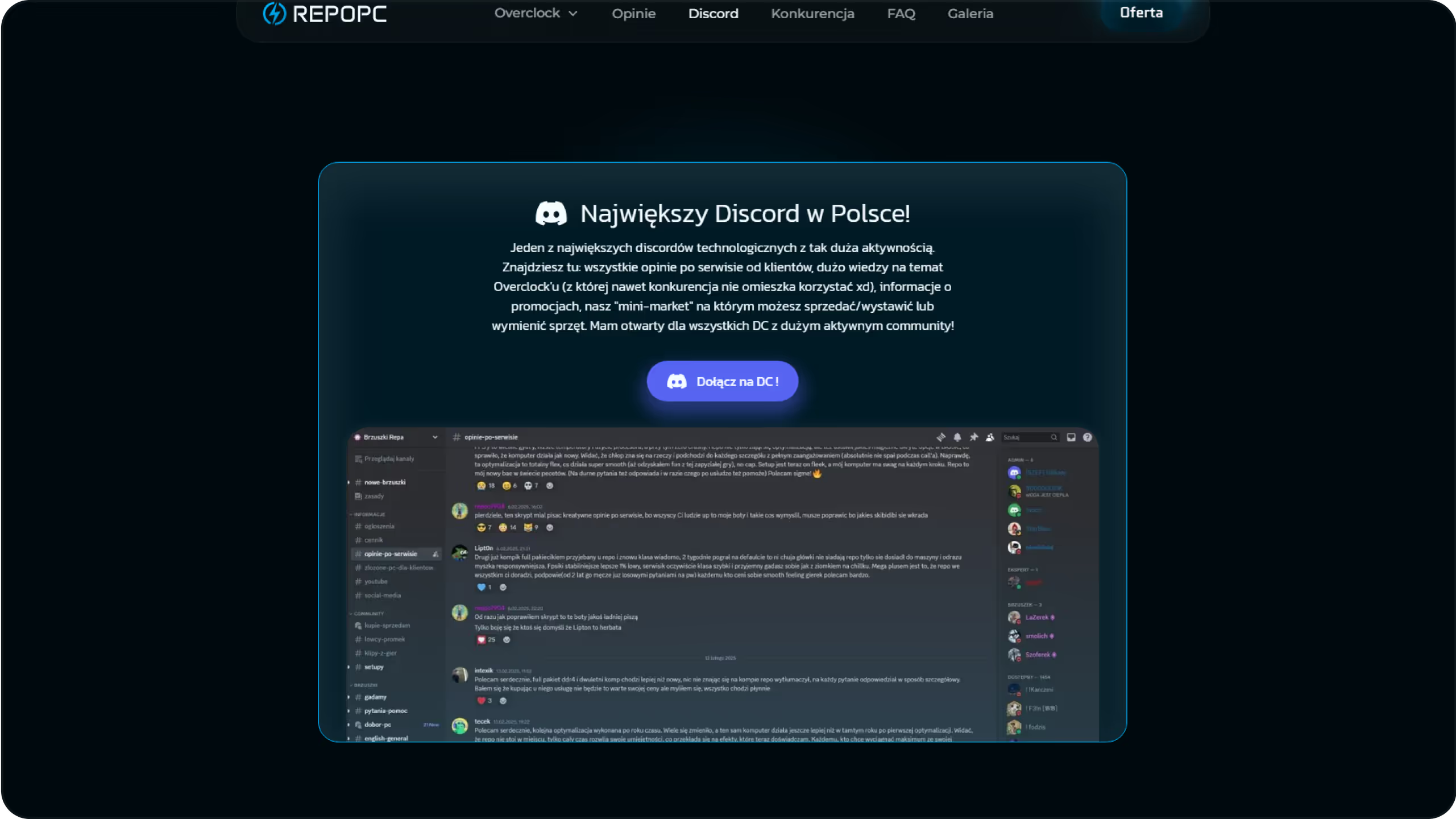
Discord isn’t just a contact method - it’s the core of Karol’s business. To make users more comfortable and curious about joining, we created a dedicated section showcasing what the server looks like, how it works, and what they can expect.
This approach builds familiarity, trust, and removes uncertainty. Just seeing a glimpse of the platform already makes it feel safer and more accessible.
That single section and button alone brought over 70 new users to the server (tracked via GA).
I added subtle, end-of-journey CTAs inviting users to join the Discord server one after reading all testimonials, and one at the end of the gallery. This strategy gives users another way to engage if they’re not ready to buy immediately. For example, in the testimonials section, it’s almost like saying: “If you don’t believe us join and see for yourself.” It helps build trust, lowers resistance, and attracts new users to the community,even if they’re not yet ready to become customers.
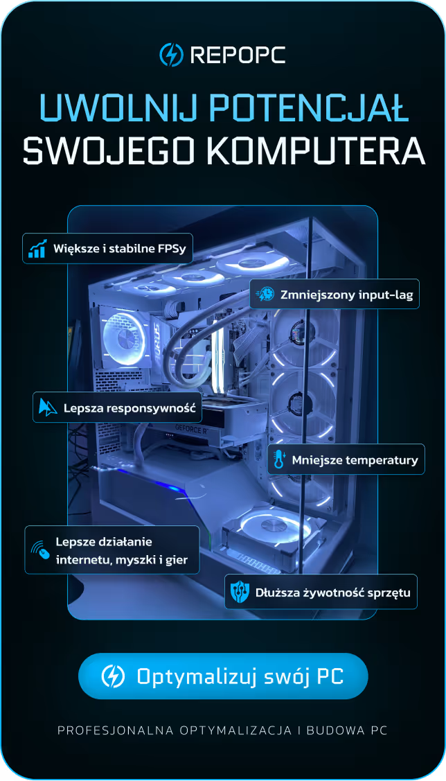
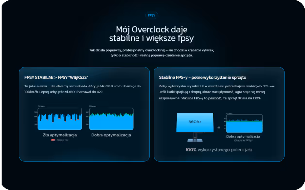
Started with outlining the general benefits, and then I addressed Karol’s clients’ biggest concerns and broke down how the entire service works, showcasing real features, concrete examples, and authentic screenshots from the process.
As I mentioned earlier during the “copy before design” phase,
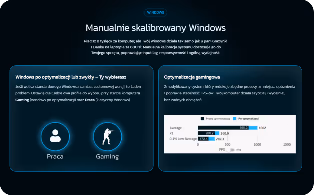
I built the entire structure of this below-the-fold section before any visuals were made. Since most users don’t fully understand what overclocking or optimization actually means, I treated the page as a guided narrative, something that educates while building trust. The order of sections wasn’t random: I started with FPS (the #1 concern), moved into input lag (closely tied to performance), followed by BIOS (the most technical part), and ended on Windows. a smaller part of the service, but still critical and often underestimated.
During my discovery interview with Karol, one thing stood out, every single client he spoke with asked the same thing upfront:
“How many FPS can you get out of my PC?”
This wasn’t just a curiosity it was the top concern, the mental block preventing them from buying. So I decided to tackle it right away.
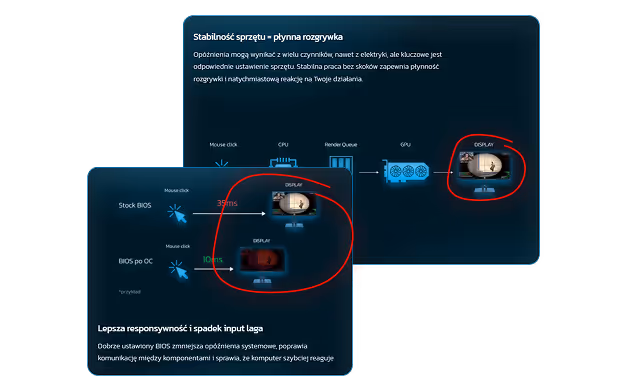
Instead of making bold claims, I explained what really matters: not just higher FPS, but stable FPS, and why it changes everything.
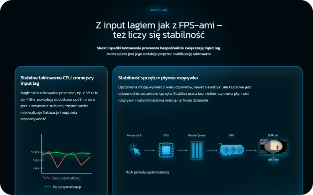
Right after FPS, I introduced input lag the second most overlooked performance factor.
Since both stability and responsiveness are tied closely together in gaming, this placement felt natural.
Even the headings on Karol’s site reflect this connection. Most clients don’t know why their PC feels “slow” this is where they learn.
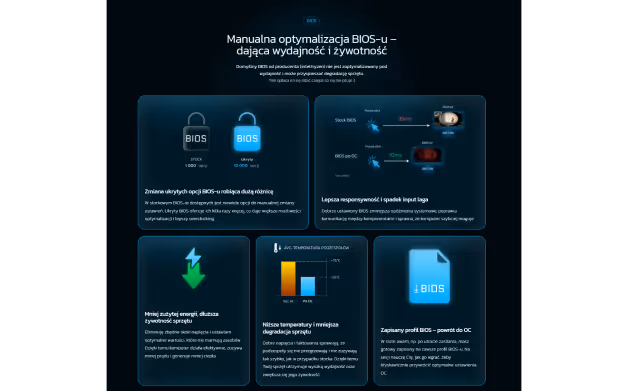
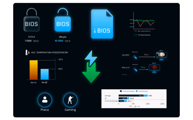
Once the main concerns are addressed, I introduced BIOS optimization Karol’s most technical and unique selling point.
Since many users don’t know what BIOS even is, I used visuals to simplify the concept and paired each feature (e.g. saved profiles, hidden settings) with a direct benefit.
The bento layout breaks down complex ideas into digestible parts, showing exactly how Karol’s service goes far beyond surface-level tweaks.
Although it makes up a smaller part of Karol’s process, Windows optimization plays a huge role in system performance.
That’s why I placed it last, after users already understand how FPS and BIOS affect their PC.
By the time they reach this point, they’re ready to see how the final layer brings everything together, input lag, stability, and speed included.
Once the main concerns are addressed, I introduced BIOS optimization Karol’s most technical and unique selling point.
Since many users don’t know what BIOS even is, I used visuals to simplify the concept and paired each feature (e.g. saved profiles, hidden settings) with a direct benefit.
The bento layout breaks down complex ideas into digestible parts, showing exactly how Karol’s service goes far beyond surface-level tweaks.
During early interviews, Karol mentioned that many clients came to him after bad experiences elsewhere, often asking him to fix what others had broken. That’s why I added a small section that directly compares his service to the competition. It’s not about throwing shade - it’s about owning the story, removing hesitation, and showing users they don’t need to do extra research.
The visual speaks for itself: even if someone’s not a gamer, the difference between “1” and “10” is crystal clear. And for those who are the Faceit level reference hits home. It's a subtle wink that says: yeah, we know you get it.
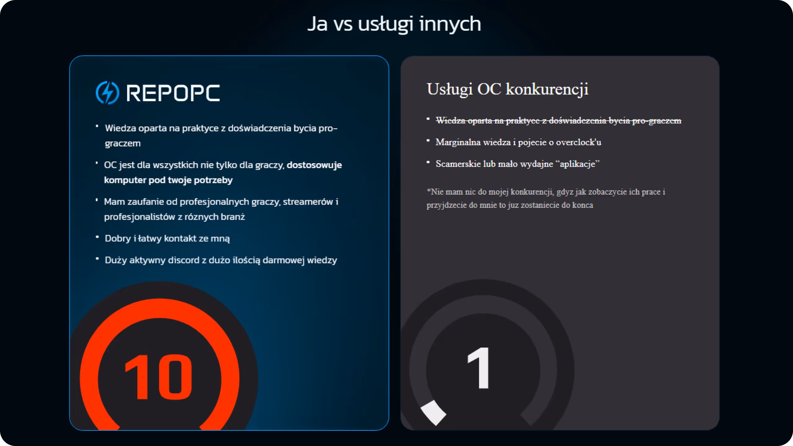
The “10 vs 1” comparison doesn’t just show value for gamers, it works as a simple visual comparison for newcomers, but for the right audience, it hits deeper. it’s a Faceit-level reference. Anyone familiar with competitive "Counter Strike" will instantly know what it means. We’re in on the joke and they know it.
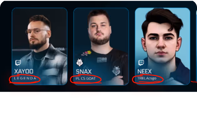
In the testimonial section, every creator is listed with the nickname their fans actually use:
Xayoo “Legenda”, Hyper “Totalny Szef”, Snax “PL CS GOAT”, Tuszol “Wędkarz”, etc.
These aren’t made-up titles, they’re known, used, and loved by the community. It’s a nod to the audience that says: we’re from here too.
Instead of dropping in a generic stock image or an empty placeholder on the monitor graphic, I decided to add a real frame of Szeliga streaming CS, a streamer well-known in Karol’s community.
It’s a subtle easter egg that only the observant catch. But once people noticed, especially on Karol’s Discord, the reactions were instant tons of laughs and comments like “bro that Szeliga clip in the graph killed me xD.” A small touch that says: yeah, we’re in on it too.
I created the entire marketing strategy and visual system from banners and paid campaigns to organic social presence. Every touchpoint, ad, and post was designed to stay on-brand, build recognition, and bring in new clients.
A simple yet consistent visual language based on bold typography, dark theme, and a touch of gaming aesthetics. Just enough to give the brand its own voice without overcomplicating the interface.
A stream banner is a small visual under a Twitch stream often overlooked, but always there. I went through top Polish streamers’ channels and noticed one thing: most banners looked the same loud, generic, and easy to ignore. So I flipped the approach. I designed a clean, high-contrast banner that actually grabs attention and drives clicks to Karol’s site.
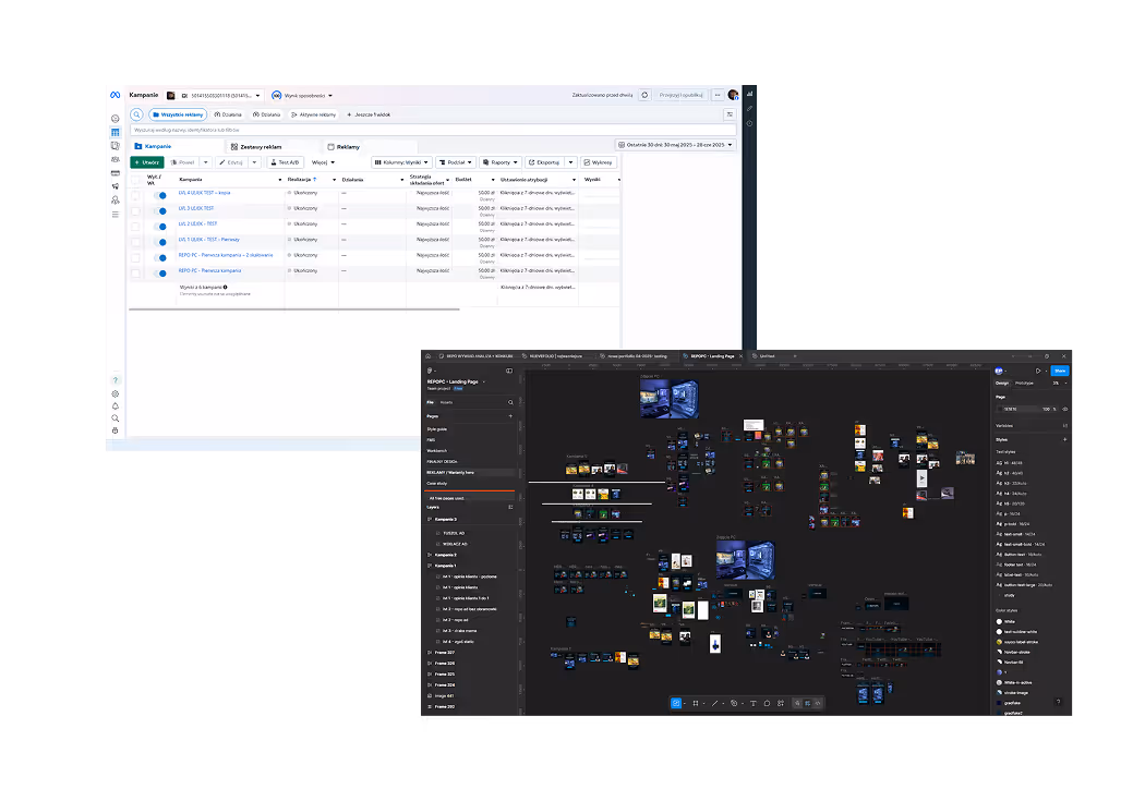
My first time running paid ads, and i made every złoty count. Planning every campaign around the awareness funnel model. I let the algorithm do its job by running campaigns broadly and giving it room to learn. With a consistent 100zł budget per campaign, I reached the right people and converted 61 times over seven total campaigns.
I didn’t throw random ads into the void. I used two methods of testing to learn fast and scale smarter:
- First, I built adsets that tested one ad per awareness level (1–4). These gave me a clear idea of how each funnel stage performs on its own.
- Then, I switched to isolating performance by funnel level launching 4 ads per level in separate campaigns. My goal was to find one winner per stage and combine them into a super adset I could scale with confidence.
This wasn’t guessing. It was controlled testing and it paid off.
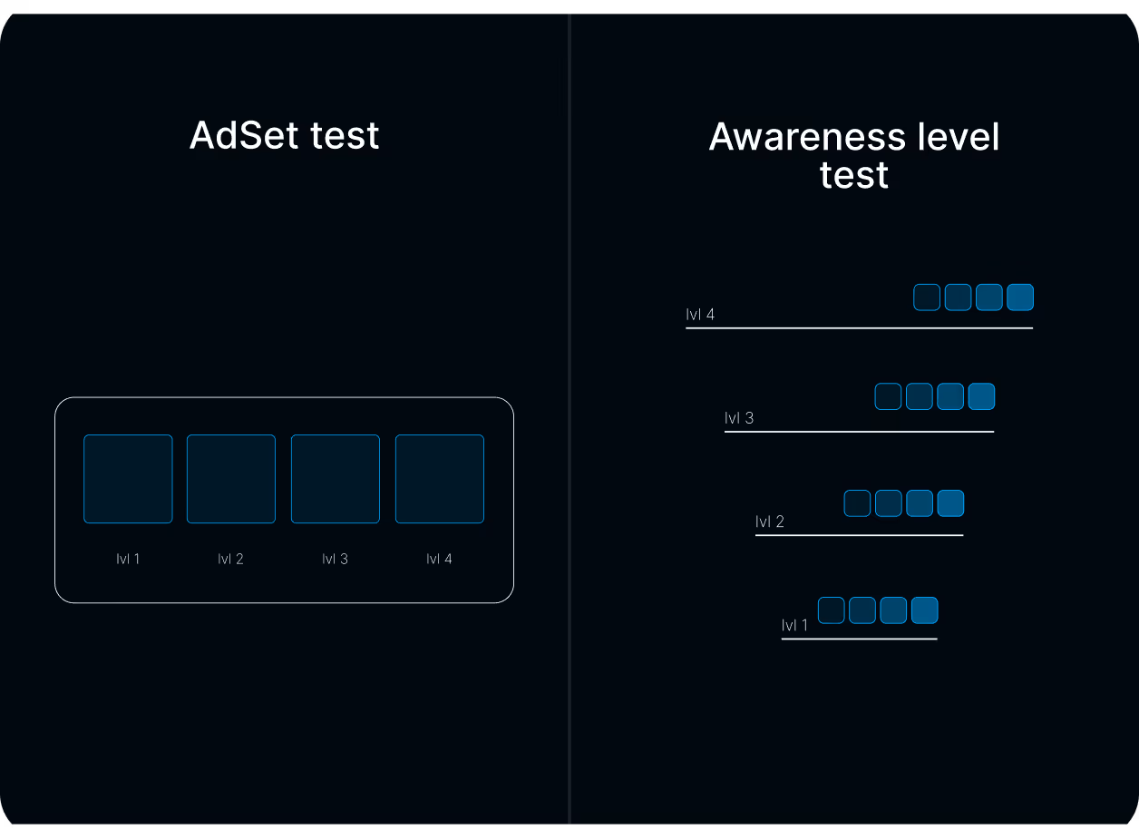
Since I only had one ad per awareness level ready at the start, I chose the adset testing method one ad per funnel stage (lvl 1–4) in a single adset. This let me test the full funnel structure right away, while I was still preparing more creative for deeper testing.
The result? 6 conversions on my first campaign ever.
But I noticed something important: most conversions came in at the very end of the campaign. That told me Meta’s algorithm was still learning and the potential wasn’t fully reached yet.
So I made a decision: I ran the exact same adset again. Same structure. Same budget. No tweaks.
And I was right the algorithm learned. The second round delivered 10 conversions. I wasn’t guessing. I observed, adapted, and scaled based on data.
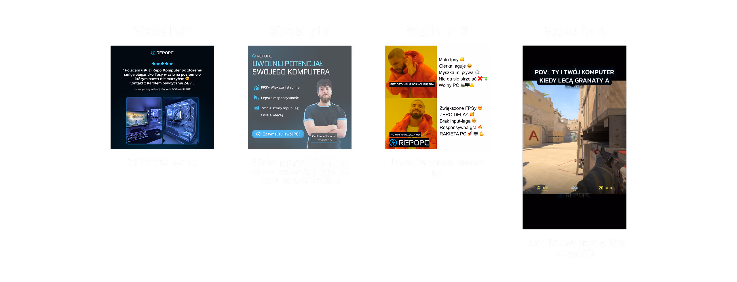
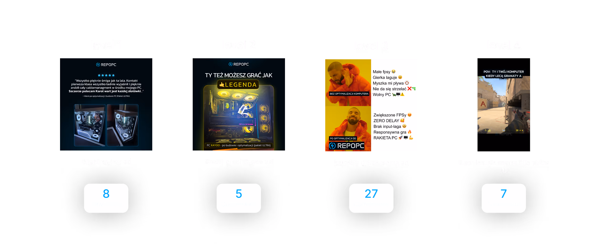
Instead of guessing, I tested methodically building four separate campaigns, each targeting a specific level of awareness. Every level had its own logic, its own audience, and its own winner.
Here’s how I ran the tests and which ads made it into the final high-converting adset.
At this stage, the goal was simple: reach people who already knew what they wanted, they just needed a final nudge to buy. So I leaned into the most powerful trigger I had: social proof.The entire campaign was built around real feedback from Karol’s Discord direct quotes from happy customers and photos of their setups after working with him. These weren’t generic testimonials. They were personal, enthusiastic reactions from real users and that hit home.
📊 Results:
– 14 conversions (updated number from Meta Ads)
– Best ad: 8 conversions at just 4.54zł per conversion
– Avg. cost per conversion: 6.28zł
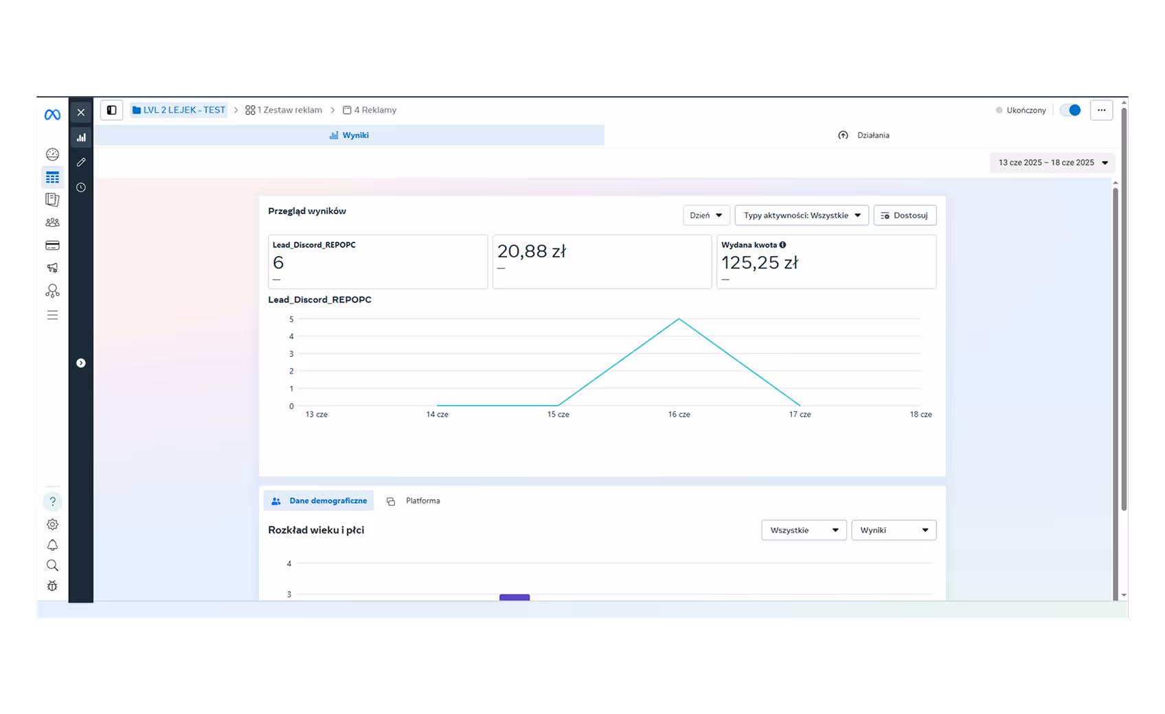
This stage was about reaching people who knew the product existed but needed a reason to believe it was better than the rest.
I prepared four unique ads and launched a 48h campaign. But just a few hours in, Meta paused the campaign due to a billing issue. It dumped the budget too fast, without time for proper learning and the early results were dead silent.
So I adjusted. I restarted the campaign and extended the window to give Meta a real shot at optimizing.
Conversions started coming in fast. The same ads, same audience, just smarter delivery. That small pivot made the difference.
📊 Results:
– 6 conversions
– Avg. cost per conversion: 20,88zł
– Best ad "Xayoo AD", 3 conversions at 13,98zł
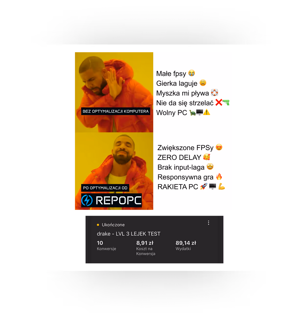
At this stage, the goal was to reach people who knew they needed a solution but didn’t know Karol’s service existed yet. So the hook had to do all the heavy lifting.
I went for humor, familiarity, and proven performance.
The Drake meme which already performed well in earlier tests made a strong comeback and absolutely crushed it again.
This campaign ran smoothly for most of the time, but was unfortunately cut 3 hours short due to a Meta account issue... again 😢 Still, results were strong and likely would’ve broken our lead record had it run its full course.
📊 Results:
- 11 conversions (with 3h left on the clock)
- Best ad: Drake meme = 10 conversions
- CPC = 0.38zł, 9,689 views, 8,091 reach
- Additional ad “Search” showed potential: 1 conversion with just 2.50zł spent
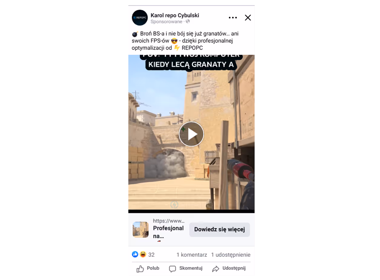
At this point in the funnel, I wasn’t targeting users who were ready to buy I was reaching people who weren’t even sure they had a problem yet. So I needed to speak to them differently.
I built this campaign around a relatable story and a punchy video ad that didn’t push the service too hard it simply resonated. The goal was to entertain while planting the seed of awareness.
And it worked: the video ad did almost all the heavy lifting converting leads while sparking laughs.
📊 Results:
- 8 conversions total
- Best ad: Video = 7 conversions at 6,54zł per conversion
- CPC: 0,39zł with 5,986 reach and 7,285 impressions
- Total cost: 73,17zł (Avg. 9,15zł per conversion)
Just a tiny detour before the grand finale 😄
After each test, I put together detailed reports in Google Docs and sent them over to Karol.
We barely managed to hop on a call during the whole process, he was swamped with orders most of the time 😂
So Docs became our main touchpoint. They helped him track what I was testing, what worked, and what we’d double down on next.
Simple, async, and effective.
Since many users don’t know what BIOS even is, I used visuals to simplify the concept and paired each feature (e.g. saved profiles, hidden settings) with a direct benefit.
The bento layout breaks down complex ideas into digestible parts, showing exactly how Karol’s service goes far beyond surface-level tweaks.
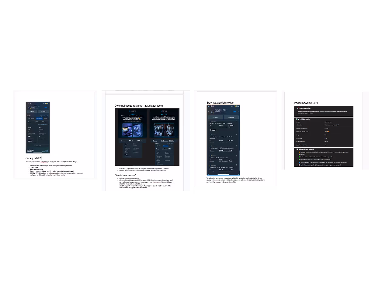
The numbers don’t lie and these were the undisputed winners. No guesswork, just results that proved themselves in the data. Each ad crushed its awareness funnel level — and together, they formed the final Super Adset.
And the MVP? 🦉 Drake meme. Drizzy. 6 God. Champagne Papi. Dominated the competition and left nothing standing
Lorem ipsum dolor sit amet, consectetur adipiscing elit. Suspendisse varius enim in eros elementum tristique. Duis cursus, mi quis viverra ornare, eros dolor interdum nulla, ut commodo diam libero vitae erat. Aenean faucibus nibh et justo cursus id rutrum lorem imperdiet. Nunc ut sem vitae risus tristique posuere.


Time for some of my own reflections, a few lessons I took away from working on my first commercial project.
First off, let’s start with a bit of a funny pain point: “working with influencers” 😅. I quickly learned they’re busy people, and sometimes you need to arm yourself with a ton of patience while waiting for materials or photos to arrive.
Another realization: Facebook is ancient. Changing something as simple as a page password or adding an admin is never solved with a magical one-click button. Instead, you’re forced to dig through multiple tabs and if it actually works the first time, you’re both surprised and happy.
The next lesson was about running my first live campaign. Honestly, it felt a bit scary at the start, I didn’t know what to expect. But once I launched the first ads (and then the next ones), I was hooked. I loved diving into optimization, pulling insights from the data, and adapting based on numbers. Something I was afraid of at first turned out to be one of the most fun and rewarding parts of the project.
On the design side, being both designer and developer taught me an important mindset: “I need to design this in a way that will be smooth to implement in Webflow.” That simple perspective saved me a massive amount of time. I remembered how, in my earlier works, I came up with “cool, crazy” portfolio ideas in Figma but when it came to actually building them in Webflow, I got stuck and wasted hours trying to recreate unnecessary visual gimmicks. This time, the workflow (pun intended ) was smooth. I also picked up a lot of little tricks along the way: digging, de-constructing other sites, testing ideas. I can really feel my progress as both a designer and developer.
And finally, since this was my first commercial project, the whole experience - scheduling calls with a client, receiving live feedback from their customers on Discord, solving real issues, improving and scaling a real business showed me something huge: I love this. I enjoy the process, I feel hyped, and I want more. A lot more 😎.